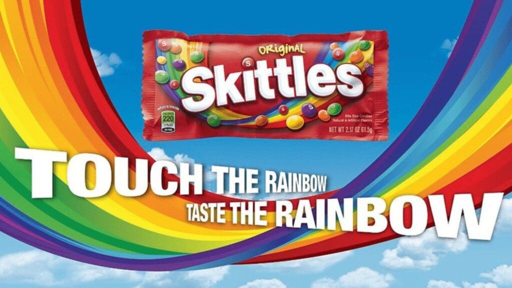
Without colour, McDonald’s golden arches would be… just a kind of curvy M, Barbie would be a lot less exciting to the next generation, Skittle’s would need to seriously rethink their tagline, and the world of visual Distinctive Brand Assets would probably not exist.
There are two ways colour applies to DBA’s – either as a Distinctive Brand Asset in and of itself, or more often it plays a supporting role, working to connect brand activity and strengthen the wider asset suite. Here we’ll explore examples of both, plus some recommendations to keep in mind while devising a colour strategy.
Colour is generally a low performer in the world of distinctiveness. Only a handful of brands can rely on it as a primary asset, with just two out of nearly 100 single colours or combinations from recent Distinctive BAT studies reaching as high as 50% Brand Attribution.

There is a limited palette of colours to choose from, so creating a unique approach is tricky to say the least. In a visually crowded environment establishing a distinct colour identity requires relentless repetition and commitment. Yet, the payoff can be immense.
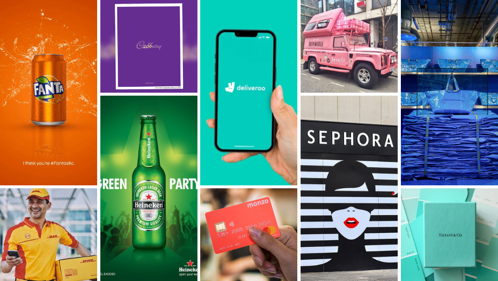
Take Cadbury, for example. Their rich purple hue is instantly recognisable in the confectionary aisle and easily attributable to the chocolate brand. Reinforced by brave advertising that contains colour and not much else, Cadbury purple serves as a stalwart asset, reinforcing the brand's identity across product ranges and global markets.

In a bold strategic move, the recent Barbie movie leveraged the colour pink in its advertising, featuring billboards including only their distinctive colour, font, and film release date. When we tested this among a group of females aged 16-24, nearly 80% accurately attributed this to Barbie.


Deliveroo's teal branding dominates its app interface and marketing materials. Leveraging every opportunity for brand visibility, Deliveroo's ubiquitous colour reinforces its presence wherever its delivery riders go, driving thousands of glances (or stares, if you happen to be waiting on an order) daily.

DHL is an example of a brand utilising two colours. They activate their yellow and red combination across all touchpoints, helping to drive association with the mail shipping business.

While some brands let colour take the lead, the majority use it as a tool to support other assets.
Consider National Geographic, with its iconic yellow frame – a combination of shape and colour - utilised on the magazine and then amplified through advertising. Without colour, we see just a grey box. When we add yellow, our memory starts to connect the dots (or lines as the case may be).

Even incorporating colour in subtle ways can significantly enhance memory associations, as illustrated by the below debranded Sprite bottles (read our case study on Sprite’s Label Free Trial here). A comparison between one bottle entirely in greyscale and another with only the cap recoloured reveals a dramatic increase in Brand Attribution of 51 percentage points, demonstrating the indelible supporting role green plays for the brand.
Many brands bolster their asset suite through with multiple colour choices and combinations, whether it's Sephora's use of black and white stripes, Mastercard's red and yellow circles or indeed the Skittle’s rainbow.

While colour as a standalone Distinctive Brand Asset isn’t achievable for all brands, it will always play a critical supporting role across an asset suite. When a brand has effectively weaved their chosen hue(s) through all assets and activity, creating synergies, memory links and generally looking great in the process, well then they have struck gold.