Having a distinctive approach to advertising pays back handsomely. While it might seem obvious, when your advertising looks like you, it ensures your communications are linked and attributed back to your brand. It enhances creative effectiveness, increasing the likelihood of consumer recognition, recall, and memory association. But a logo isn’t enough on its own and can be a blind spot; think about the last time you sat on a subway looking at the ads. Did you even notice the logo? In addition, with so much passive and skippable advertising, a logo is also not always even in view.
A distinctive ad style can help you stand out amongst the plethora of brands you compete with in the battle for attention. Following safe category norms in advertising can often just benefit the category leader, and while category codes are sometimes required (for communicating Category Entry Points for example), the brands that plough their own path stand out in the sea of sameness.
With all these challenges and the realisation that a good chunk of advertising reach is simply just a small nudge to remind people your brand exists, a key focus for brands is in creating a distinctive approach to advertising, which helps negate the aforementioned issues. Individual DBAs, such as characters, icons or jingles, amongst other asset types, can do a lot of the heavy lifting when they are featured and the hero in advertising. Some brands, however, look to create a distinctive ad style, and the ad style in its own right becomes a Distinctive Brand Asset.
Here are some approaches brands have taken to create a distinctive ad style and DBA.
It's easy to say, but harder to do. The brands that have succeeded here have been consistent over a long number of years in embedding an ownable ad style. The Economist is a best-in-class example of a brand that has been consistent in using colour to create a distinctive ad style, leaning on genius copy lines and targeted media buys.

Source: Laura Dirzyte
DHL uses a mix of yellow and red in its advertising and vans, replicating its logo, to drive consistency across assets and touchpoints.

Source: Ads Of The World. Agency: Grey Group
A common approach, this involves simply using some type of framing device consistently across touchpoints. Like a lot of ad styles, it is much easier to activate in static advertising, causing difficulties in having a consistent approach across TV/AV advertising.
Apple is one brand which leans on this approach, especially when it comes to OOH. While it is often flexed depending on the campaign, the white background/frame generally remains consistent. EY is one of the best examples of a B2B brand trying to stand out from all the “man with laptop” advertising, leaning on a yellow framing device across ad formats.

Source: Benamic

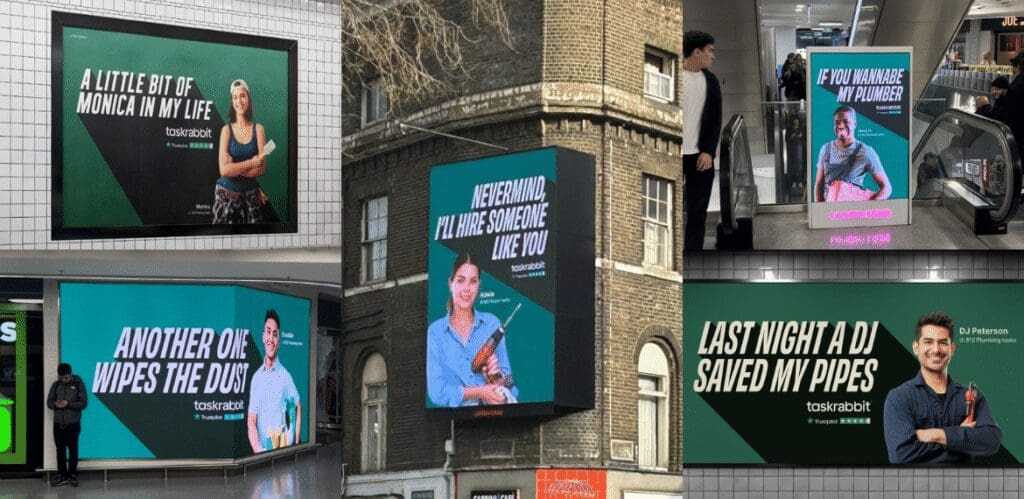
TaskRabbit has used a copy-led framing device accompanied by some smart and humorous copy. This allows for consistency but also flexibility; they can have many different versions to highlight the variety of Taskers available.

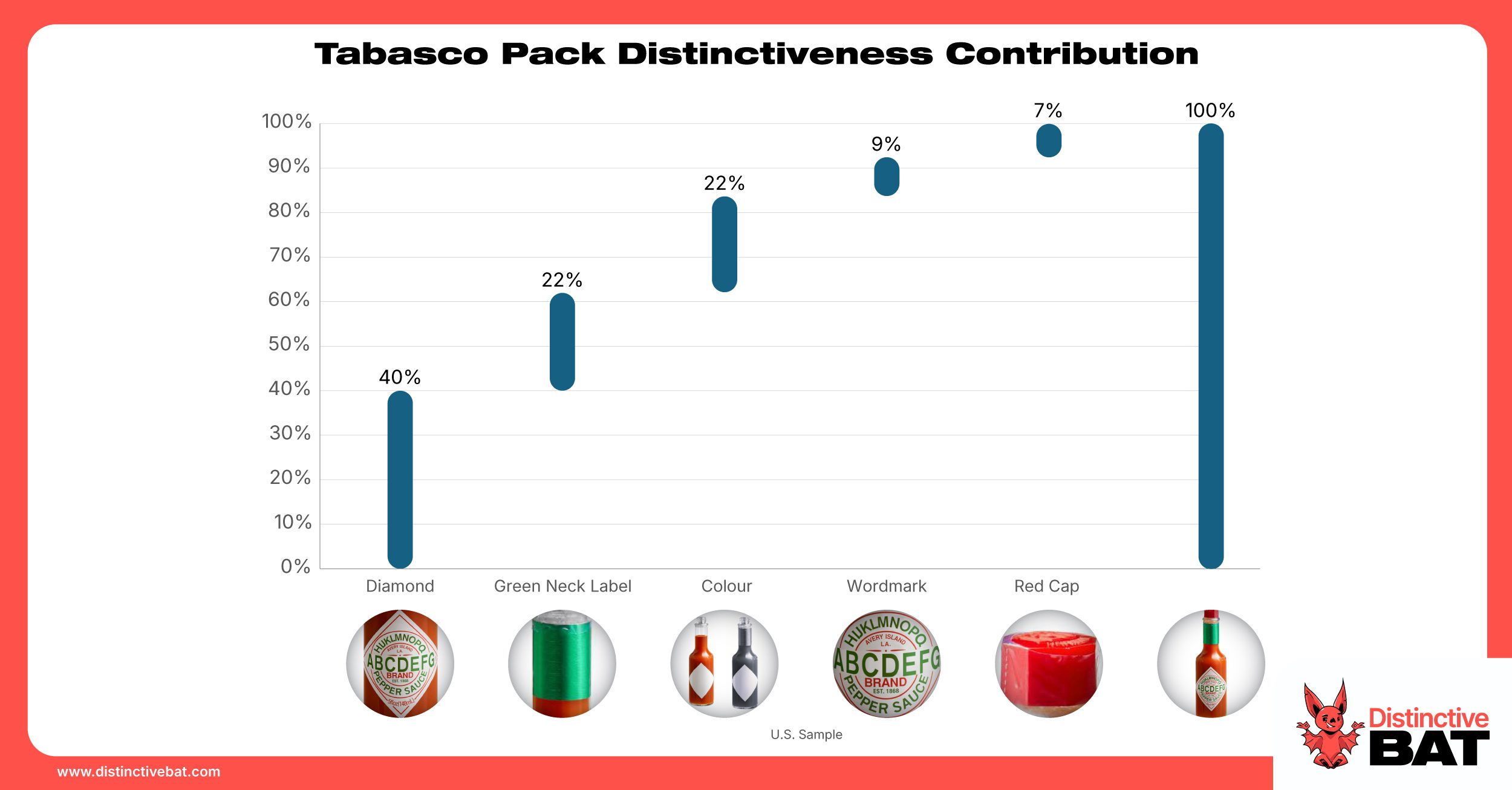
This approach sees brands lean on a distinctive asset which originates elsewhere, for example, the logo or pack, in creating a distinctive ad style that is unmistakably them. This is a GREAT approach for brands to take, as the focus on the asset in advertising allows it to be further embedded, resulting in wonderful synergy. Even one well-trodden distinctive asset that lives in the logo, on the pack and across advertising, amongst other “touchpoints”, can be enough for a brand to win in the distinctiveness stakes.
HSBC are well known for bringing their icon front and centre in their advertising, and National Geographic bring their yellow frame from their magazine into focus to create something that is unmistakable National Geographic.

Claritin is a brand who borrows their pack in creating a unified look and feel, sky and grass, blue and green, it is consistently used in advertising with lovely synergy. A quick Google image search for the brand to see how consistent they are. Not only does this approach allow for distinctive advertising, but it also helps ensure their pack is a strong distinctive asset in its own right, helping it to stand out on shelf.

Vegemite, like Claritin, links its ad style to its pack using colour and logo lock-up. This is simple but incredibly effective.

Source: Brand Twitter Account
Whiskas’ new ad style borrows the cat head shape from the pack, and colour, to create an approach strongly linked to the brand.

Source: World Design Awards
Sephora meanwhile bring their key assets from front of store into the advertising, the black and white stripes are a flexible device that ensures brand linkage.

Source: Spot6Management
Another common approach involves taking a lead from other distinctive assets, such as colour and shape, and developing a unique art direction that is used across advertising and other touchpoints. The Dunkin’ ad style is a good example of this, relying heavily on bright colours to create a standout distinctive advertising style.

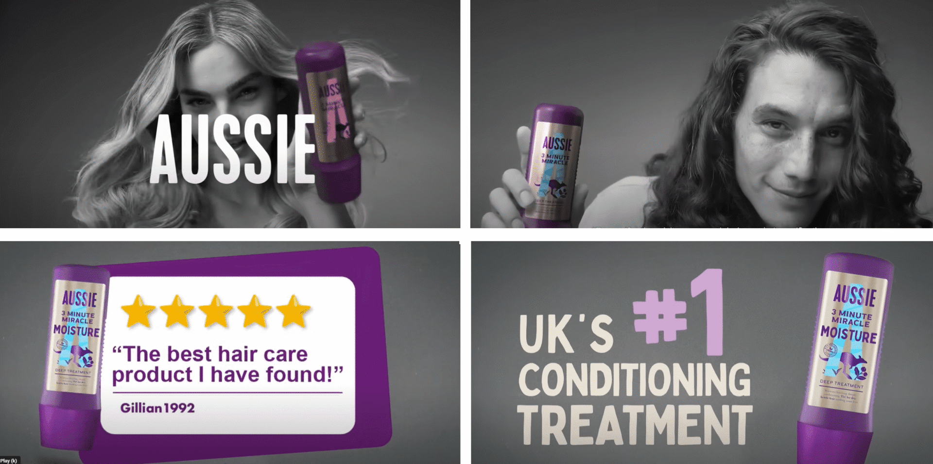
Aussie, the shampoo and conditioner brand, is a best-in-class example of a distinctive ad style. Leaning on brand colour, they focus their brand by using black and white videography in some markets, interspersed with their brand colour.
Red Bull is a well-known example of a brand with a distinctive ad style they use in TV/AV advertising, and have frequently used a common illustrative style over a number of years.
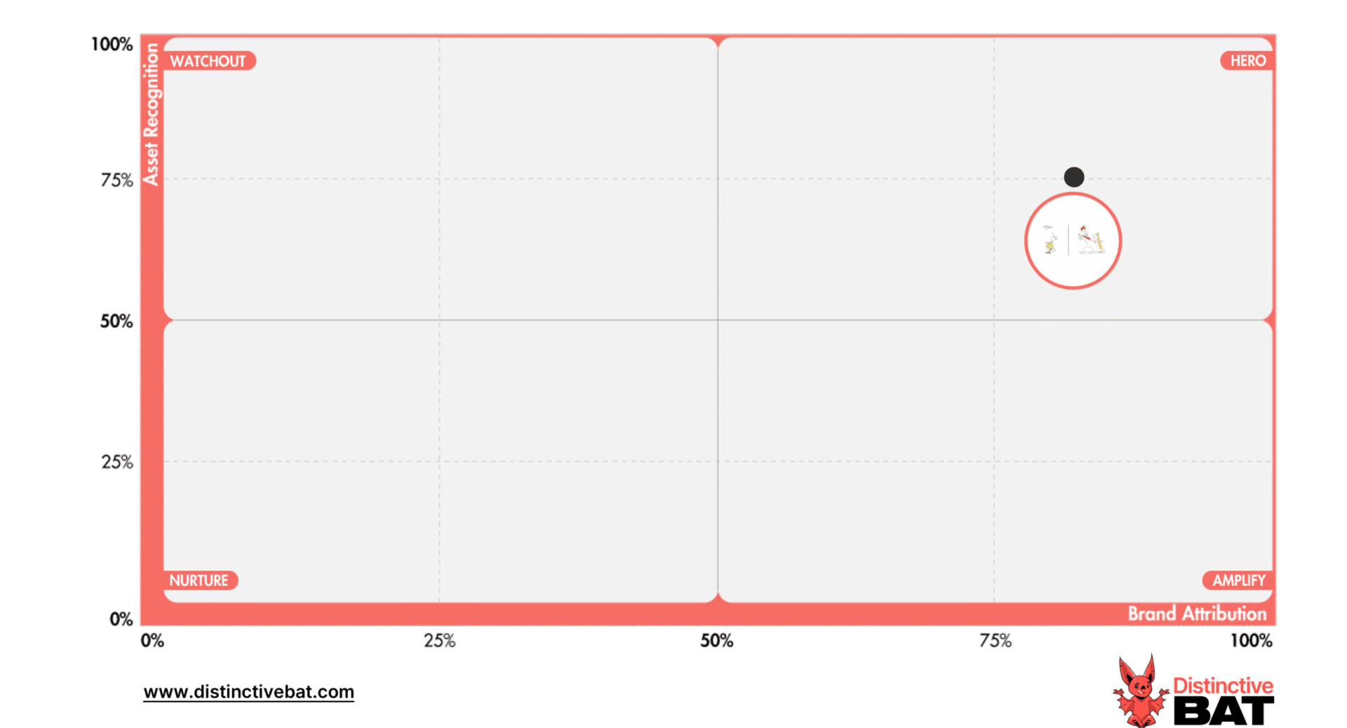
As seen on the Distinctive Brand Asset Grid from a DBA research in the U.K., this ad style is a “Hero” garnering both significant Asset Recognition and Brand Attribution.
Deliveroo, which has very strong equity in colour and their icon/character already, recently launched a new approach to advertising which uses animation in helping the brand stand out during ad breaks.
Accenture is another brand that recently launched a new global creative campaign. This campaign pulls its key brand assets in colour and icon to create a templated art direction that can be used across campaigns.

The U.K. crisp/chip brand Tyrrell’s also has a lovely approach, which links both art direction and a golden thread. It uses old B&W footage intertwined with colour on both packs and in static and AV advertising.

Oatly has disrupted the oat “milk” category to great aplomb, using a heavy font-led approach, which the brand has been very consistent with.

Another approach is to develop a brand world in which the brand plays, utilising some key distinctive assets or related assets. Quite often, a brand world is the sum of parts.
Hendrick’s Gin plays in a Victorian brand world while leaning considerably into the cucumber and their iconic bottle. This is used across AV advertising, as well as in OOH and on-trade assets.

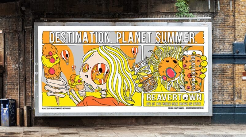
Beavertown is another alcohol drink which has created a brand world through quite psychedelic illustrations across advertising, product and merchandise.
While this approach can be disruptive, care is needed. Key distinctive assets can often get lost in the noise of a rich, disparate brand world.
Finally, some brands utilise quite generic category codes or assets but play with them either in a unique way or very consistently to create a style of their own.
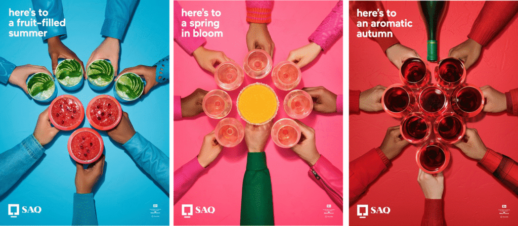
Quebec-based alcohol retailer SAQ is a great example of a brand with a simple but effective and distinctive advertising style using category-generic glasses of alcohol but in their own way. Their ads iterate with the seasons, while maintaining a core and continuous structure.
Source: Ads of The World
While most IKEA advertising is product-led (which can become unstuck when it is very category-generic), it leans on additional elements such as art direction, grade, and smart copy to create standout advertising which, to most, is unmistakably IKEA.

Landing on a flexible but consistent ad style can be powerful for a brand, and it should be a key aim of any Distinctive Brand Asset workstream.
Contact us here to understand how your Distinctive Brand Assets perform or for help tracking your distinctive assets.