Two years ago, Kia, the South Korean car manufacturer revealed their new logo as part of a rebrand. It is said to be a symbol of Kia’s new brand purpose of “symmetry, rhythm and rising elements that embody Kia’s confidence and commitment to customers”.
While anecdotally quite slick, this new branding forgot about the primary role a logo plays - making sure people know it is you.

The logo has seen much consternation online for the difficulty people have in reading it, with Google Searches for “KN cars” dramatically increasing as people come across the car but not know which brand it belongs to. Searches have increased nearly monthly as their new range of cars hit the road (with some like the EV6 quite stunning it must be said), with a further spike in Nov 2022 (90k searches), perhaps driven by their World Cup sponsorship.

Distinctive BAT, a Distinctive Brand Asset research consultancy, undertook our own research in the U.K. amongst a nationally representative sample of 500 people to see just how bad the problem is, and the results won’t be too pleasing for the Kia brand team…
Our distinctive asset research would generally see us debrand assets such as logos, advertising or characters (e.g. for a logo, testing a similar version but with the letters “ABC”) to understand if people, firstly, recognise that asset and then, secondly, if they can attribute that asset to the correct brand. For this particular research, however, we left the logo as is so the test should be much easier.
Overall, only 50% of people recognise the new logo and can correctly attribute it to Kia, versus 86% for the old logo.
When we plot this on a brand asset grid, using two key metrics, we can see where the difference lies:
Only 65% recognise the new logo versus 95% for the old logo - perhaps not surprising considering that, while the new logo has profited from large-scale advertising and huge World Cup sponsorship reach, it is only 24 months old. We would however expect a much smaller difference for any rebrands as consumers should instinctively recognise the updated logo of a big brand, especially car brands being so ubiquitous on the street.
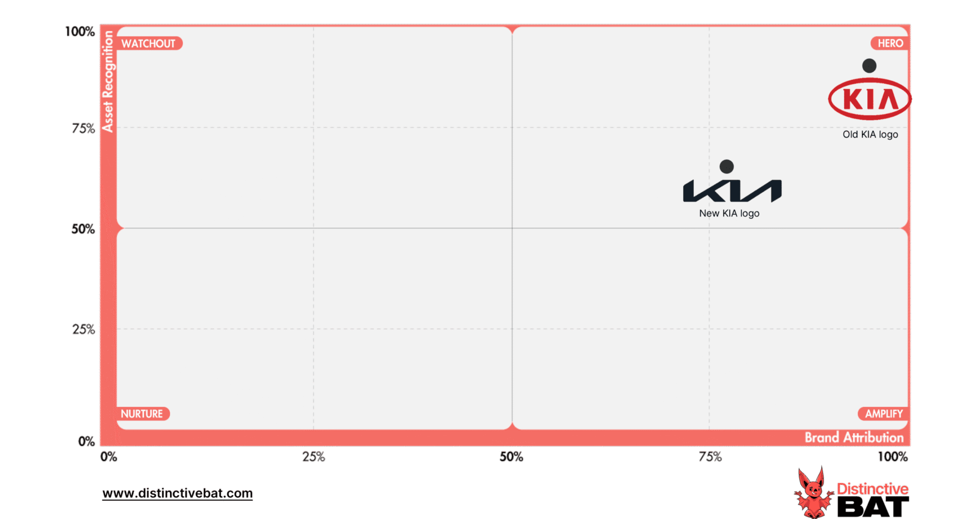
When we look at Brand Attribution, we can see only 77% of people can correctly attribute the new logo back to the brand, i.e. nearly 1 in 4 recognisers can’t tell you what brand it is after seeing the logo.
What this all means, in the short term anyway, is that Kia’s advertising & sponsorship is much less impactful and effective. They are not helping consumers bridge the gap between their advertising and the brand. While these metrics should improve over time, it still represents a faux pas when it comes to branding; yes, brand logos can communicate meaning (in this example modernity), however, its main role is to ensure a strong link between the asset and/or piece of communications back to the brand. As Mark Ritson would say “first, they must know that it’s me”.

The main lesson we can learn from this is to be careful with any brand refresh and not forget about the fundamental reason for a logo; branding in its simplest form. Make sure your logo is legible to all and, if in doubt, undertake research to understand if there are any issues with legibility.
Apart from this, be careful with wholesale changes or indeed dumbing down your logo into pure script. As the most featured brand asset, it can be a wonderful asset for embedding further branding devices, (think McDonald's M, Microsoft 4 colour window, Adidas 3 stripe etc.) that make your advertising work harder and your brand more distinctive.
If you want help understanding the strength of your brand assets, contact us to find out more.