The Barbie movie launch campaign has received much coverage in recent weeks with the plethora of activations globally. From the pink Malibu “Dream House” to toy store Instagram frames to Xbox crossovers, it’s got it all.
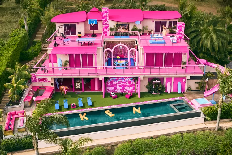
PHOTO: AIRBNB/HOGWASH STUDIOS
One particular activation in London piqued our interest. A pink billboard appeared in multiple locations with just a date and nothing else included. No other info or even a brand name. It flies in the face of what is normally required for any advertisement to work, to communicate a message related to the brand or campaign, but more so that it is well enough branded to ensure it is attributed correctly to said brand (or movie).
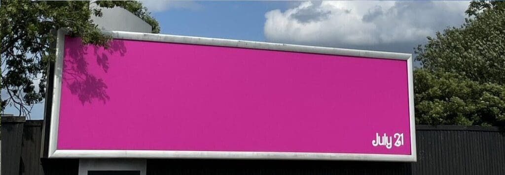
Photo credit: Jennifer Killens on LinkedIn
Needless to say, a key feature of this billboard is to encourage curiosity based on its sparse nature, which it certainly has done. Of course, not many other “brands” could get away with this creative idea. Saying this, we were still interested in understanding if this execution could work even with the Barbie franchise, and how well embedded pink is with the brand. As we find time and time again in our Distinctive Brand Asset research, colour can be so difficult to own on its own. That isn’t to say colour is not important, it just works better when used in tandem with another element such as shape (Think National Geographic and their yellow frame).

We decided to check performance, measuring this execution (somewhat as a proxy for colour) against two key measures. We looked at Asset Recognition (how well the asset is recognised) and Brand Attribution (of those who recognise it, how many can attribute it to the correct brand). We also included other well-known franchises with movies out this summer for comparison purposes. As can be seen amongst a national representative U.K. audience, while not very highly recognised, it still has some good attribution scores amongst those who recognise it, with 64% Brand Attribution, beating the likes of the long-established Mission Impossible. Despite the sparse nature of the billboard, it also didn’t feature too far behind the mega franchises of Indiana Jones (77% Brand Attribution) and Transformers (78% BA).
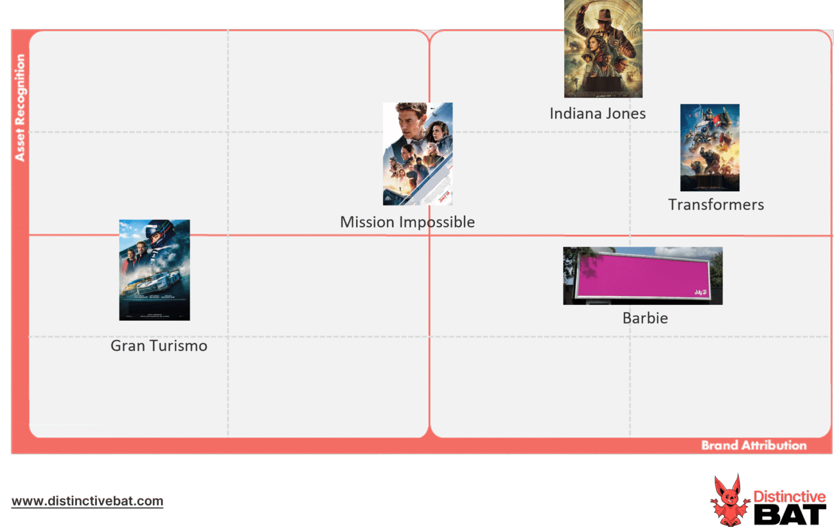
However, when we look at the (presumably) important demographic of female 16-24 year olds, we can see how strong the colour pink works for the brand. It outperformed all other franchises in Brand Attribution, scoring 78%, beating Transformers by 1% (PP), albeit with lower reconition levels.
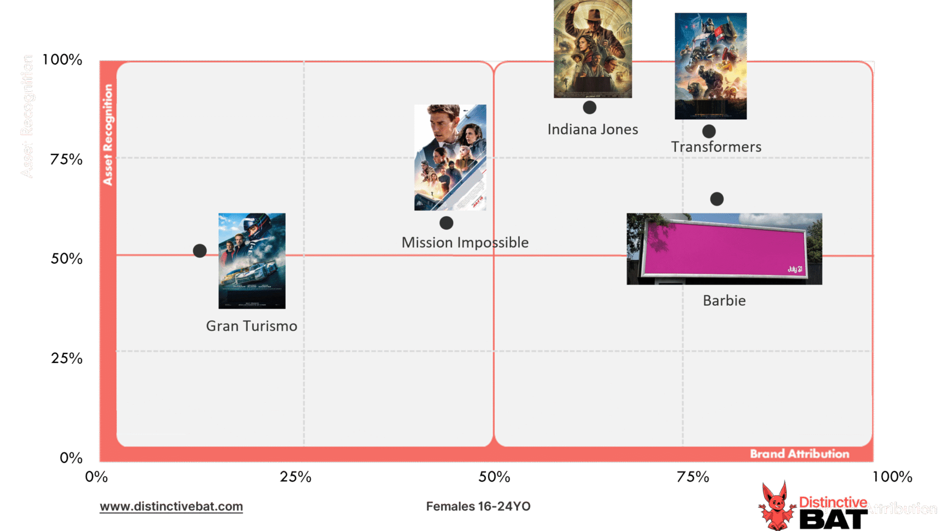
This shows how smart, and in reality safe, it was for the brand to not feature any movie name or indeed other branding cues. It also helps show that owning a colour in isolation is possible when done right. We would still caveat this with the fact it is difficult however, and recommend using it in synergy with other brand assets.
If you would like help understanding how your brand assets perform, please reach out to us.