What makes one logo great and another one…forgettable? There are many guidelines and rules out there for creating great logo designs. However, as the great designer Tom Geismar puts it, “Logos are funny things. At first, they are just designs on paper. Eventually, they come to embody all the qualities of the organization they represent”, meaning their effectiveness is not just about the design, it’s also about the organisation they represent and how they are applied and used. It is hard to objectively evaluate a logo design and apply hard and fast rules to it in isolation. However, we do believe you can go a long way by creating a distinctive design that is used and applied consistently. Of course, to be consistent, the logo will need to be flexible and legible at any scale, and to be distinctive, it must contain unique and ownable elements that will stand out and help to build memory structures.
Looking at some great logo designs in action can help us understand this principle as well as identify other common characteristics of successful logos.
Doritos: Embracing Distinctiveness
Starting with arguably one of the most distinctive crisp/chip logos out there, Doritos, with its bold use of the triangular product shape, is the clear signpost for the tortilla category. Despite the triangular nature of many tortilla brands, Doritos has truly made it their own by incorporating the shape across all touchpoints, from the product itself to hero-ing it in the logo lock-up and centring it in their advertising. You can’t think of Doritos without thinking of the triangular product, and it’s hard to think of tortilla chips without thinking of Doritos first.
The triangle has been part of their identity since the mid-80s, when it first appeared to top the ‘i’. Over time, the shape has continued to gain prominence, until its latest iteration in 2013 put it front and centre, having it cut through the wordmark. Add to that the vibrant colours and a dynamic font style, and it successfully captures the brand's edgy personality, ensuring instant recognition and top-of-mind awareness in the category.
Source: Zen Business
It is rare to find a logo mark that remains untouched for decades, but so too is it to have such a simple, yet ownable asset. The yellow frame lived on the front page of the magazine from its very first issue in 1888. With a changing cover every month, that frame and the name were their only consistent assets. It’s a great example of the power of consistency, as that simple yellow rectangle became entirely ownable for the brand when they decided to leverage it to achieve unity across the various segments they had expanded into. The genius of this logo lies in its adaptability, seamlessly serving as a visual cue across the brand's various platforms spanning from magazine covers to television, while maintaining a consistent and recognisable identity that grabs attention.
Source: 1000 Logos
Proving that you don’t need years of history to achieve logo success, this is a great example of distinctiveness trumping all else. The logo predates TikTok, it was created for a Chinese app called Douyin that allowed users to lip-sync to music. The logo is the letter ’d’ crafted into a musical note. The stand-out factor is thanks to the use of colour that creates a movement effect. Apparently, Douyin means something close to ‘shaking sound’ in Chinese, so it was a perfect symbol for the brand. Despite TikTok being a video-based platform and the logo not entirely making sense for what the app would become, it stood out, it was simple yet innovative, it was distinctive, and it stayed.

The Red Bull logo has never changed. It is a shining example of how Distinctive Brand Assets (DBAs) can drive brand recognition. There is symbology going on here that perfectly communicates Red Bull’s personality, but first and foremost it is the use of powerful imagery that makes the logo so distinctive. It needed to be; they were creating a new category. They needed to set themselves apart in a big way. The logo communicated what the brand stood for and also brought together highly distinctive assets - colour, shape, and symbol – which have become embedding vehicles for Red Bull's identity across various platforms. Given the impactful nature of the logo, it is unsurprising that the brand boldly places it front and centre in all activations, further amplifying its impact. It is through the consistent use and amplification of these elements that Red Bull has transformed its logo into a powerful visual cue.
KFC is a great example of a brand that understands its distinctive assets and how to leverage them for maximum effect. The logo has undergone several iterations over the years, and the Colonel has featured in all but the first. Using a character, synonymous with the brand's heritage and products has created a valuable asset unique to KFC. By consistently incorporating the Colonel into their logo since 1959, and then placing him front and centre for over 25 years, KFC has successfully established strong memory structures that connect the character to the brand. One could argue the visual association is so strong that the Colonel’s image is as recognisable as the brand name itself. The logo we see today further reinforces these associations by mirroring the shape of their iconic chicken bucket. This consistent use of their distinctive assets creates a seamless connection, a golden thread, from the product to the logo.
Source: 1000 Logos
An example of a very straightforward logo, featuring a repetition of the brand name in image and words. Wonderfully simple - down to the font and colours used - and very effective. Whether intentional or not, it also does a good job of communicating the uncomplicated nature of the service. This straightforward, yet effective, design demonstrates how a logo can succinctly encapsulate a brand's identity, making it instantly recognisable and memorable. Interestingly, Dominos has moved in the opposite direction to KFC, where their logo used to be locked up into the shape of a pizza box, the two assets are now shown simply side by side. This has allowed the wordmark to be shown more clearly, allowing for greater scalability and consistency of use. This is a good example of logo simplification; allowing ample white space for the elements to breathe, while protecting its unique characteristics. Not all brands manage to achieve this balance. A recent study by Distinctive BAT into logo simplification revealed that when a logo is overly simplified, omitting crucial brand elements, it can negatively impact brand recognition and attribution.
Source: 1000 Logos
A demonstration of the power of character-centric branding. Placing the Quaker Man front and centre in their logo has created a robust link between the logo and the brand's heritage, turning the mascot into a hallmark of identity and credibility. The strength of the link is such that the mascot could be recognised on its own, without the brand name. It is a surprising move to see that the size of the character relative to the wordmark has been reduced as part of the 2022 redesign.
Even in 1972 the late, great designer, Paul Rand understood the importance of distinctiveness and the ability to apply it consistently: “In the competitive world of look-alike products, a distinctive company logotype is one, if not the principal, means of distinguishing one product from that of another” he wrote in the opening lines to the logo guidelines. It is said he ensured the logo could be used across all possible applications. And he did a great job, the logo is still in use today. The logo shows that an icon or character isn’t always needed, in this case, it was actively avoided as it was acknowledged the business was complicated enough. But this only worked because the font is unique enough to stand on its own. With its bold and distinctive 8-bar striped pattern of the lettering, accompanied by the striking use of blue colour, the logo exudes a sense of stability and innovation. IBM's consistent application of this distinctive visual identity across various platforms and communications further reinforces its position as a leader in the tech industry, setting a strong example of how a logo can make a lasting impact in the digital landscape.
The Warner Bros logo serves as an example of the critical balance between simplicity and distinctiveness in logo design. In recent years, Warner Bros decided to streamline and modernise their iconic shield logo, aiming for a more contemporary and simplified look. However, in the quest for simplicity, some of the distinct visual elements that had long been associated with the brand were lost. Recognising the importance of these assets, Warner Bros has since reverted to a design that retained the essential characteristics of the original shield, recapturing the distinctiveness and heritage that had made the logo an enduring symbol of entertainment. This strategic shift highlights the brand's commitment to maintaining a consistent and distinctive visual identity that resonates with audiences and reinforces its position as a leader in the entertainment industry.
When protecting your distinctive assets, subtle simplification can be a great exercise to optimise a logo. The updated version of the Post-it logo keeps the post-its front and centre, but by decluttering the logo they now stand out as a distinct element, without fighting with the word mark. As a result, the whole design becomes simpler and easier to process.
Michelin has a brilliant example of a logo that has achieved incredible recognition the world over and has stood the test of time. Despite the many versions of the Michelin Man, Bibendum, as he was named, he remained recognisable throughout - building distinctiveness for more than 100 years. The fact he was created during the rise of mascot popularity, instilling him with a rich back story and distinctive personality (that kept pace with the times), likely contributed to the strong emotional connection and affection that people developed for the character. It remains a prime example of how a distinctive and consistent design can endure the test of time, showcasing the lasting impact of a well-crafted logo. The iconic Michelin Man continues to serve as a powerful symbol of the brand. Michelin's consistent character use alongside the brand name creates a cohesive and recognisable visual identity, reinforcing the brand's commitment to quality and safety.
Source: Logo My Way
The Tide logo shows the power of simplicity and consistency in creating a lasting and impactful visual identity. The brand's bold and clean lettering, accompanied by a vibrant orange colour, creates a distinctive and easily recognisable logo. Tide's consistent application of this visual identity across various packaging and marketing materials serves as a range unifier across the SKU’s, creating a strong brand presence on shelf. With its simple, yet bold design, it establishes itself as a recognisable category marker with continued use.
Source: WIX
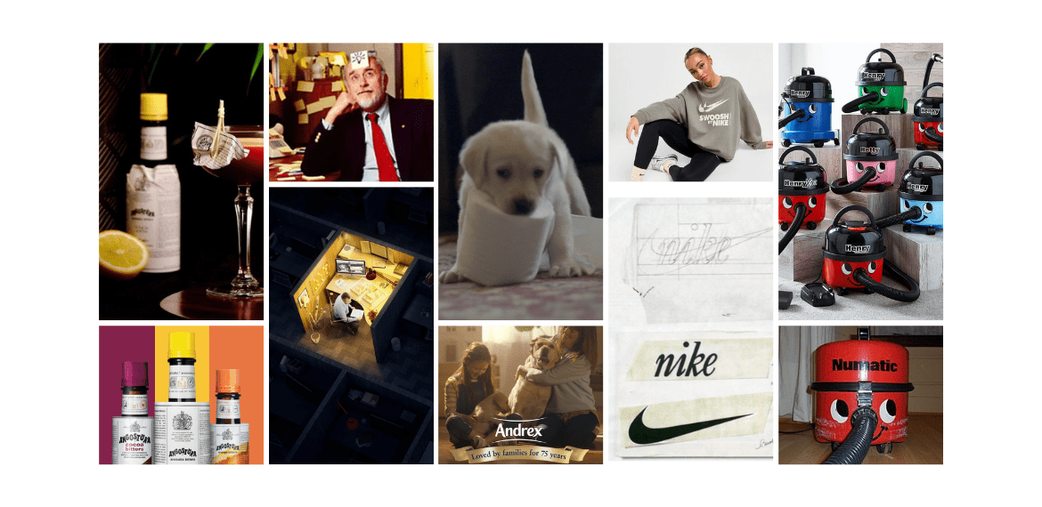
Adidas uses a distinctive logo strategy that seamlessly integrates the logo with its product identity. Unlike many brands that maintain a consistent logo across their range, Adidas adopts varying logos while preserving the fundamental essence of the three stripes - a symbol intrinsically linked with their brand. This unique approach allows Adidas to flexibly adapt its logo to different product lines, without diluting the core identity that the three stripes represent. It is important to recognise that Adidas has earned the privilege to play with the logo this way through their dedicated efforts to embed the logo and the three-stripe icon, a feat that many other brands have yet to achieve. Despite these variations, the brand manages to preserve the simplicity and distinctiveness that have become synonymous with the Adidas logo, ensuring that the three stripes remain a constant thread through their diverse product portfolio.
Source: SoccerBible
Although analysing these iconic logos won’t give us the magic formula to guarantee logo success, we can identify some underlying principles of great logo design. Distinctiveness is the hallmark of enduring logos. They carve a unique identity through the use of distinctive or stand-out elements. As the examples here have shown, there is no formula for distinctiveness - it has been achieved in different ways, from eye-catching visual effects through to the use of long-standing stand-out characters.
Consistency, consistency, consistency.
Golden thread: The most distinctive brands ensure they link their logo and logo elements across all touchpoints.
Balancing simplicity and adaptability emerges as pivotal for a logo's impact. But simplification must be a careful balancing act with protecting the elements that make the logo unique.
If you would like help understanding how your logo or Distinctive Brand Assets perform, contact us here.