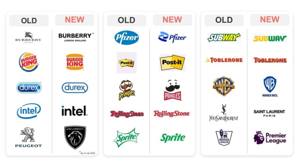
In recent years, a design trend has emerged that has seen the pairing back of brand logos, a reductionist approach to logos, and in many ways brands, where elements of a brand or logo have been removed. Debranding, a concept brought to the fore by the work of writer & brand strategist Ben Schott, sees certain features, icons, and detail removed from logos. While logos are only one aspect of branding in their purest form, they are the most visible asset and highest reach of any brand and thus play an important role. Below are some examples of logos before and after they went through their debranding.

The most common reason given is the shift to mobile media consumption and the reduction in available pixels. With mobile-first design becoming a key component of any design brief, brands are thinking more narrowly about how they appear on mobile devices (e.g. a social post versus a print ad). This has resulted in white space and the removal of previously used elements or icons (Intel is a prime example of this). Design trends are undoubtedly at work; designers draw inspiration from other designers, and c’est la vie a trend develops. In recent years, the fashion industry has seen a strong shift toward minimalist sans-serif logos, see Yves Saint Laurent and Burberry above for examples of this (the trend being perfectly captured via the logo image comparisons widely shared in recent years). Another reason is that marketers are doing what we do best: changing things up (which isn’t always necessary!). A logo is usually at the forefront of any brief that requires brand revitalisation (despite the fact that a logo represents only one part of “branding,” and “branding” represents only one part of what a brand actually encompasses in total. It's the tip of the needle, a crucial part, but a small part). With the average CMO tenure also trending down, this expedites the issue, a new CMO so often sees a rebrand enter the discussions. While some of the new logos on the market are aesthetically more appealing, many of them throw the baby out with the bathwater.
The oversimplification of logos (and brand worlds) has several downsides. The first and most obvious is that any logo change disrupts memory structures and diminishes its use as a branding device. The breadth of this diminishment is really down to how far the logo strays from its original guise or, in extreme cases, how legible it is (The new illegible Kia logo being a case in point here). In the short term, this would have an impact on brand attribution for any advertising, reducing the impact in terms of salience and advertising message association. Ultimately, the effectiveness of the communications. In most cases however, time, reach, and money will help bring the new logo’s score back up to match the old version in terms of its strength as the primary branding device. The biggest disadvantage is that the logo’s role in embedding additional assets is reduced. As the most commonly used asset across packaging, social media, advertising, app icons, and so on, it allows brands to embed additional branding devices (think the Intel circle swoosh, Microsoft four-color window, or Adidas three stripe, for example), which can later be used to make their advertising work harder and be more distinctive. Burberry is a great example of this evolution, as they moved away from using the knight character and have only recently reintroduced it in all its glory.

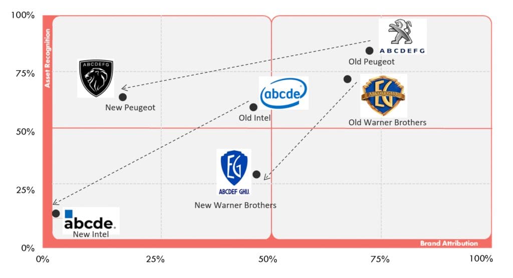
We at Distinctive BAT, a Distinctive Brand Asset research and tracking consultancy, studied the old and new logos of several brands that have changed their logos in recent years to see what effects this has and how it affects people’s memories. We aggregated three metrics used in brand asset research and tracking to show the differences between old and new logos. The score comprises of Asset Recognition (+) Brand Attribution (-) Misattribution

Looking at the uplift figures between old and new, we can see which logo changes have disrupted consumer memory structures. Needless to say, logos will not appear debranded as they do in the real world, but a brand cannot rely solely on its written name to be the only branding device when consumers are exposed to thousands of logos every day. Not to mention, because so much media consumption is passive, and a large part of advertising is simply reminding consumers that a brand still exists to improve or maintain salience, any branding device can help with this nudging.
We can see the negative effect for those brands that have removed vital brand elements when we look at the scores in more detail using the Distinctive Brand Asset grid (originally developed by the Ehrenberg Bass Institute). Peugeot has created a shield that is reminiscent of many football club emblems, while reducing the lion to just its head, albeit with more detail. The iconic logo for Warner Brothers has been completely flattened and simplified. Meanwhile, Intel has removed its trademark swirl. The impact of the logo and the potential to use specific features as branding tools have both diminished with all of these brands due to the removal of these memorable brand codes (i.e., no more Intel swirl).
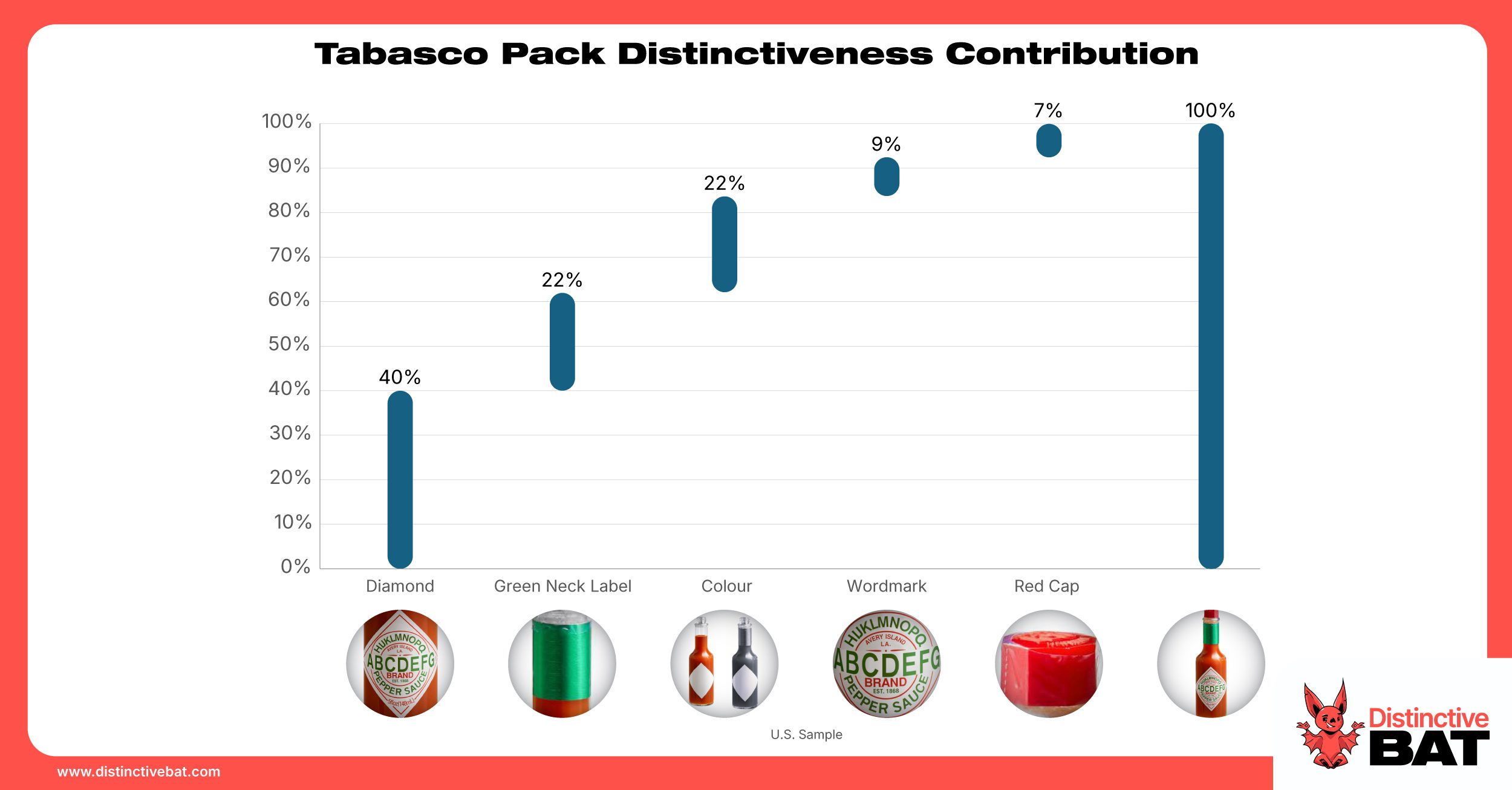
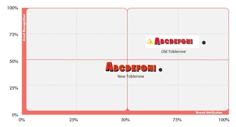
Toblerone is another good example of a brand that has equity in a logo element, in this case, the Matterhorn mountain (and related triangle shape). The inclusion of this results in a 26% point uplift in Asset Recognition and a 21% point uplift in Brand Attribution. This demonstrates the value of this asset as a branding tool for Toblerone. It should be noted that while the mountain asset appears to have been toned down in some new versions of the logo, the brand has not abandoned it and has instead doubled down on the pack, triangle element, and product shape. After all, Toblerone is a brand that was built on the back of a distinctive pack and product.
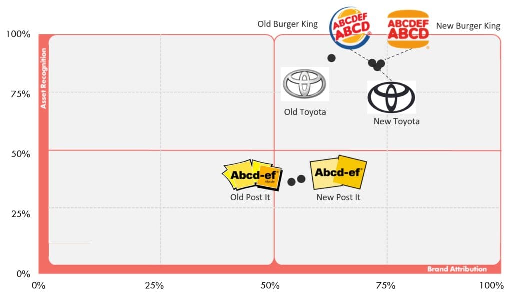
When changing up your logo, understand what is distinctive about your logo or brand and amplify it via logo research. If simplifying your logo, use reduction or white space to dial up key elements. Brands such as Toyota, Burger King & Post It that followed this approach saw gains with their new logos versus old, with improvements in Brand Attribution, often the hardest metric to move.
To modernise your brand, you don’t need to make significant changes to your logo. It’s just one facet of what your brand represents. Small adjustments can still answer the brief without having an impact on consumer memory structures.
Treat your logo as an embedding vehicle for branding devices that can then be used in other ways. The most recent Burberry logo (as of February 2023) is an excellent example of this. As the knight asset gains traction, it will serve as an additional branding device, making Burberry’s advertising work much harder.
Be careful of design trends and copying what competitors and other brands are doing because it’s on trend. To be a distinctive brand, plough your own path.
For more on debranding, check out this video from Ben Schott.
If you need help measuring your Distinctive Brand Assets or undertaking logo research, contact us and find out more