Some brand assets get to the level of iconic status and in doing so, they themselves form part of culture. Common across these is their consistent and creative use over time, all contributing to the success of their brands. Earning a place in our culture, some brand assets have even become more famous than the brand they represent! Many are trademarked, strictly protected, and carefully nurtured to retain their status.
But where did they come from and how they did they evolve into the iconic brand assets we know today?
Iconic brand assets were rarely designed for the success they have achieved. Some are the result of a fortuitous meeting and others a happy accident. Some were conceived for an entirely different purpose and, almost coincidentally, evolved over time into a powerful brand mark that instantly cues their brand to consumers around the world.
Read on for some stories behind a few of the most iconic brand assets.
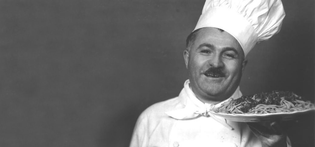
Before Chef Boyardee became a shelf staple, Ettore Boiardi was a real chef running a restaurant in Cleveland. Customers loved his food so much, they asked for take-home versions — and the brand was born. He put his name (phonetically respelled) and face on every can.
He’s one of the earlier examples of founder as asset. That tight name-to-image linkage means every interaction, whether in an ad, on a shelf, or in a pantry, reinforces Brand Attribution.
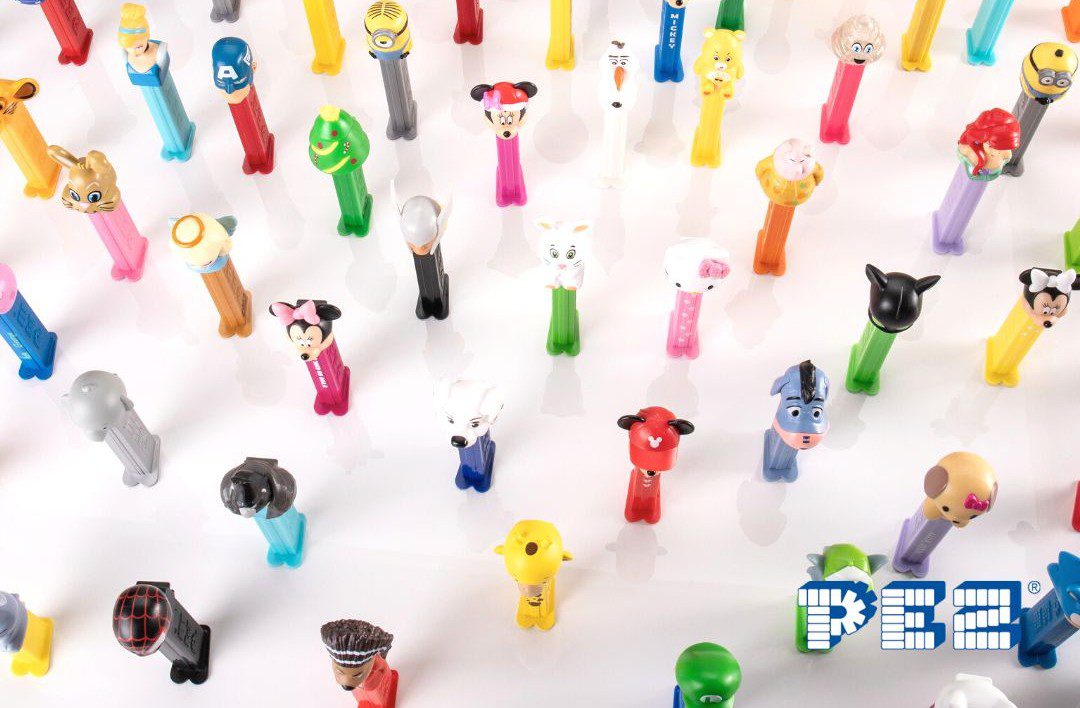
PEZ started as peppermint breath mints for adults in 1927 Austria. But the real pivot came post-WWII, when the brand shifted toward kids and invented the character-headed candy dispenser.
What followed was a clever branding strategy: the product as the asset. Suddenly, it wasn’t just candy — it was a collectible experience. These quirky heads became a key Distinctive Brand Asset, spawning conventions, collector communities, and cross-generational brand awareness.
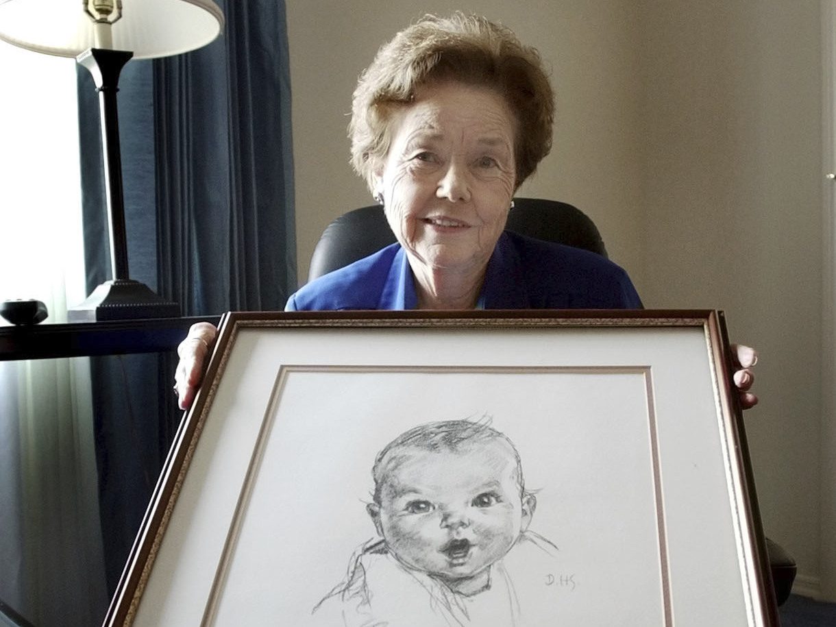
In 1928, Gerber held a contest to find a face for its new baby food range. The winning sketch drawn by artist Dorothy Hope Smith, was a charcoal portrait of Ann Turner Cook (1926-2022), submitted without polish or colour. It was never meant to be final art, but it stuck.
What followed was nearly a century of unbroken exposure on packaging ranges and enduring through logo refreshes. A fixture for the brand, there have been continued Gerber baby photo contests – a winner crowned as recently as 2024.
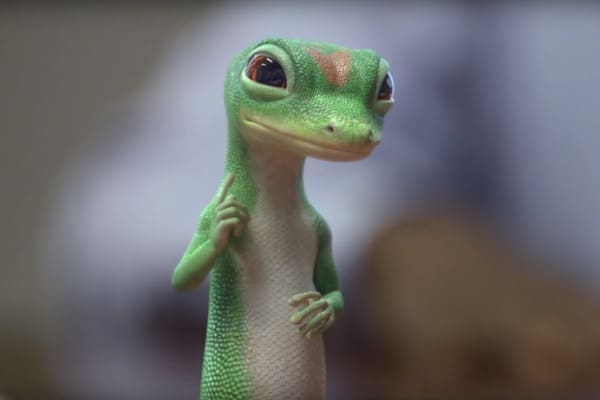
In 1999, a strike by the Screen Actors Guild prohibited advertisers from employing actors, posing a major hurdle for Geico who were about to launch a television campaign. Compounding this challenge was the frequent mispronunciation of "Geico" as "Gecko" which had been a brand concern for some time.
In a stroke of ingenuity, Geico's agency, The Martin Agency, turned to animation, creating a walking, talking gecko to represent the brand. This decision, born out of necessity, not only addressed an immediate problem but also sparked the birth of one of the most iconic brand characters in advertising history.
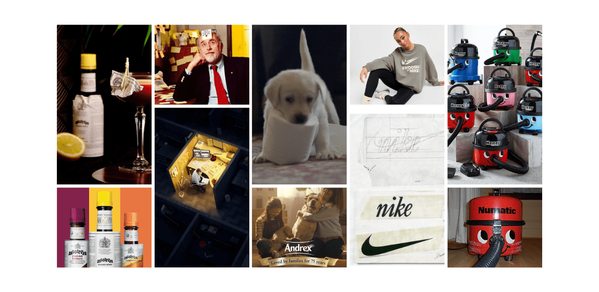
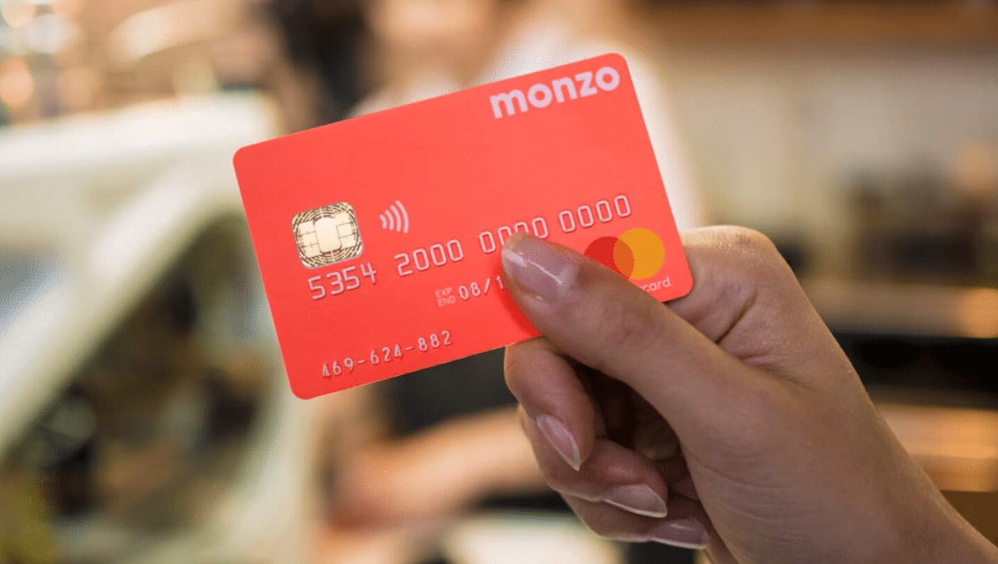
Monzo is an online bank founded in the UK, well known for their distinctive coral bank cards (as well as the zany LinkedIn posts we can’t get enough of…)
And, like many notable distinctive brand assets, Monzo’s coral card was reportedly a bit of a fluke.
According to Tom Blomfield, Monzo's co-founder and former CEO, the signature colour came about during a rush to meet a print deadline. As Blomfield recounted to Forbes, their lead designer wasn’t thrilled with the lack of turnaround time: “He said, ..well I’ll just make it colour of my shoes then if that’s how little you respect my craft. He was wearing these hot coral Nike trainers at the time, and it turned out we loved it. And that really is how it came about.”
While we wouldn’t recommend testing your designers’ patience, this is a great example of how embracing a Distinctive Brand Asset, however unexpected the origin, can lead your brand all the way to the bank.
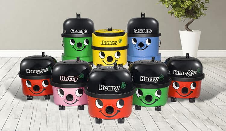
Henry the Hoover, the quintessentially British vacuum cleaner, is a Distinctive Brand Asset that blends character with product.
At a trade show in the 1970’s, Numatic International executives drew a chalk smile under the hose outlet of one of their vacuums and affixed a pair of eyes above it, affectionately dubbing it "Henry." Recognising the positive response from crowds, an advertising specialist later refined the design, creating a version of the Henry we know today. Characterised by his cheerful face and vibrant red hue – Henry was released to the market in 1981.
In the years since, supplementary characters and vacuums have been introduced, including Hetty, Harry and James. DBA’s needn’t always convey explicit meaning but can instead captivate through their stylisation and charm.
Post-it notes were created by mistake. In 1968, a scientist at 3M accidentally made the reusable adhesive while trying to create a super-strong version for the aerospace industry. A colleague later developed it into the sticky note we know today.
Post-it provides an excellent example of a hugely successful brand that only really has one Distinctive Brand Asset - the product itself.
They continue to champion and embed the yellow square notepad across advertising and in logo iterations.

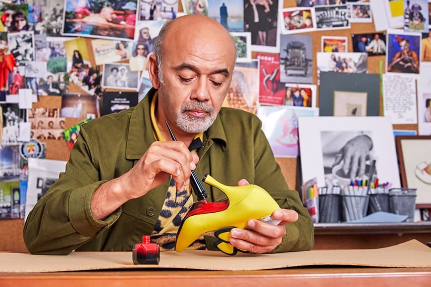
A red bottom shoe, for many fashion enthusiasts, is an instantly recognisable and iconic brand asset belonging (solely) to Christian Louboutin.
The story goes Louboutin was unhappy with the “clunky” look of the underside of the stiletto he was designing, and fortuitously his assistant was sat painting their nails a chic shade of red. A quick swipe of the polish on the shoe sole led to a prototype of the now coveted luxury footwear range.
The red sole is trademarked in many countries. Just how distinctive it is though, has been the subject of many lawsuits and litigations over the years. In 2011, the brand filed an infringement against Yves Saint Laurent in the United States, who had produced a red shoe with a red sole. A district judge denied the case stating, “Louboutin's claim would cast a red cloud over the whole industry, cramping what other designers do, while allowing Louboutin to paint with a full palette." Ultimately, the court ruled that Louboutin’s trademark stood in instances where the red sole was contrasted by the outer portion of the shoe being any colour other than red.
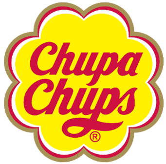
The distinctive flower logo lockup on Chupa Chups lollipops was designed by the great artist, Salvador Dali, in less than an hour.
Chupa Chups lollipops were launched in 1958 after founder, Enric Bernat, conceived the idea of putting a sweet on a stick. He is quoted as saying that, “sweets didn’t suit their main consumers, children. They got their hands sticky and ran into trouble with their parents, so I stuck a sweet on a stick.” The name Chupa Chups comes from the Spanish word chupar, “to suck”.
But Bernat wasn’t happy with the original logo and when he complained about it to his friend, Salvador Dali, over coffee, the artist started doodling an alternative. Said to have been inspired by a traditional Spanish children’s song which mentions a daisy, “Debajo de un botón”, Salvador Dali came up with the idea of putting the brand name inside of a flower. The distinctive logo remains virtually unchanged since its introduction.

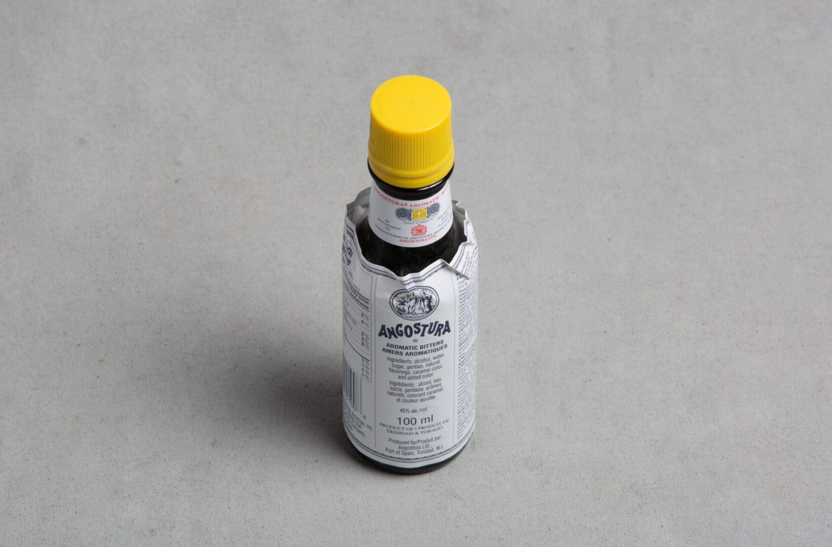
Besides its yellow cap, what distinguishes a bottle of Angostura bitters is the oversized label.
The drink was created in 1824 by Dr. Johann Siegert as a medicinal tonic for the Venezuelan army, to cure upset stomachs. The blend of herbs and spices was originally called Dr. Siegert's Aromatic Bitters and later renamed Angostura Aromatic Bitters after the Venezuelan city of Angostura (now Ciudad Bolívar).
After the founder, Johann, passed the business on to his sons in 1870, they entered a competition to raise publicity for the product. Splitting jobs between them, one brother sourced the bottles while another printed the labels. Due to a blunder, they ended up with labels too big for their bottles. By the time they realised the mistake it was too late to change it. They didn’t win the competition but one of the judges liked the oversized label and suggested they utilise it as a distinguishing brand feature. The label’s size gives the brand more space to share its story and has even inspired imitations!
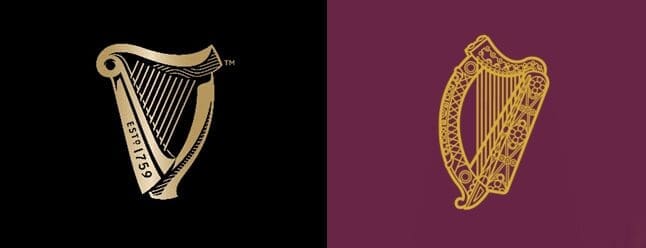
A distinctly Irish symbol, the harp has been an emblem of Ireland since the 13th century.
The Guinness harp is based on one of the oldest surviving harps in Ireland, the famous 14th-century ‘Brian Boru harp’. First introduced in 1862 and trademarked in 1876, the Guinness harp is one of three core elements of the Guinness label, along with the Arthur Guinness signature and the Guinness wordmark.
When it separated from the United Kingdom in 1922, the Irish Free State adopted the same ‘Brian Boru harp’ as its emblem. The Irish State however was forced to depict the harp facing in the opposite direction to avoid infringing on the Guinness trademark.
Whilst the Guinness harp continues to have prominent placement across Guinness packaging and advertising, the state symbol, the reversed harp, appears on the cover of Irish passports and on Irish coins.
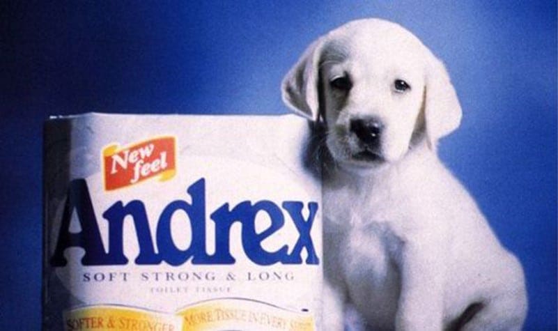
It was more than fifty years ago when the Andrex puppy first bounded onto TV screens, but the puppy's first appearance in 1972 was the result of a fortuitous accident.
The Advertising Standards Authority (U.K.) banned Andrex's initial advert proposal in which a little girl ran through her house trailing a roll of toilet paper, on the grounds that it would encourage wastefulness. The girl was removed and replaced with a golden labrador puppy.
It wasn’t long before 1972 that the advertising of toilet tissue on TV was allowed at all. Up until the 1960s, toilet tissue was only advertised in print. So, although quite unconventional at the time, an iconic brand character was born and the Andrex puppy still features to this day, on-pack and in advertising, as an instant cue for the toilet tissue brand.
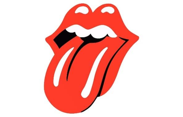
The Rolling Stones Hot Lips logo may to some be more recognisable than the band itself. It is one of the world's most famous symbols of rock and roll and anti-establishment.
The hot lips were inspired by an image of the Hindu goddess Kali, which the band gave to designer John Pasche as inspiration from which to create a logo. Kali is worshipped by Hindus as the goddess of destruction and time. Often depicted with her tongue sticking out, John represented this feature with a luscious and feminine twist.
First used on the back cover of the Sticky Fingers’ album in April 1971, the logo has appeared on every Rolling Stones album since and become representative of the band’s style and merchandise.
Tiffany Blue®, a colour so famous, it’s trademarked! Registered as a colour trademark by Tiffany since 1998, the distinctive blue is also a Pantone® colour named after Tiffany’s founding year, “1837 Blue”.
First used back in 1845, Tiffany Blue® was chosen for the cover of the Blue Book Collection, Tiffany’s first direct mail catalogue of its jewellery.
The colour is believed to have originated from the popularity of turquoise in Victorian jewellery. Considered an exotic gemstone, Queen Victoria was a fan and gave her bridal party gifts of turquoise brooches. Turquoise jewellery became symbolic of true love and Tiffany was able to effectively tap into this.
In addition to the colour, Tiffany have also trademarked the term ‘Tiffany Blue Box’ plus the white satin ribbon they use to tie their gift boxes. Another Distinctive Brand Asset!

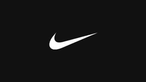
The potential of iconic brand assets wasn't always recognised at conception. On first seeing the now famous ‘Swoosh’, Nike co-founder, Phil Knight, is reported to have said, "Well, I don't love it, but maybe it will grow on me."
The iconic Nike Swoosh was created in 1971 by a graphic design student whom Phil had asked to design a logo for his new shoe company. Inspired by the Greek goddess of victory Nike, known for her speed and strength, the Swoosh logo is said to symbolize her wings.
Now one of the most recognizable brand logos in the world, it is estimated to have a value of around $26 billion. Carolyn Davidson, the design student who created the Swoosh became known as the ‘Logo Lady’ and was later given a gold ring in the shape of a swoosh and an unknown number of shares in the Nike company for her work.
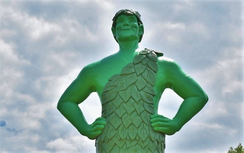
Originally the Minnesota Valley Canning Company, the Green Giant brand and character became so successful that the company changed its name!
The brand name Green Giant was created in 1925 to help sell a new variety of appropriately large peas. The associated character however was not green or very friendly at first. Pale, angry and scowling, it is said that early adverts left children crying. In 1928, the colour of the giant was changed from white to green. A smile and the word ‘jolly’ were added in 1935.
The Jolly Green Giant eventually became associated with all the company’s products. In 1950, the Minnesota Valley Canning Company changed its name to the Green Giant Company and went on to became one of the largest producers of canned corn and peas in the United States.
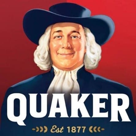
Many believe that the Quaker man, born in 1877, was modelled on the famous Quaker and founder of the Province of Pennsylvania, William Penn. Referred to as ‘Larry’, the Quaker company however insists that their brand character is not an actual person.
What we do know is that the first colour illustration of Quaker man, in 1957, was posed for by a Harold McCauley. Harold was a publishing and advertising artist, and one-time colleague of the painter Haddon Sundblom, himself famous for his Coca-Cola Santa Claus illustrations.
It’s also often believed that the Quaker company founders were Quakers, but they were not. Seymour, one of the founders, decided on the name because he thought that the Quakers sounded like nice people and that the name represented honesty, integrity, purity and strength - all of which were characteristics he wanted to portray in the brand.
The Sun-Maid maiden, whose image is on the product's packaging, was a real person!
In 1915, 22-year-old Lorraine Collett, a fruit packing company worker, was drying her hair outside her home in California when she was spotted by a director from the Sun-Maid raisin company.
Wearing her mother’s red bonnet, she was asked to pose for a painting that would be used for the newly established raisin brand's trademark logo.The resulting painting went on to be the mascot of Sun-Maid Raisins. The “Sun-Maid Girl” trademark has been updated several times over the years but has always stayed stylistically true to the original image.
Lorraine kept the painting and the bonnet until 1974, when she gave them both to Sun-Maid.

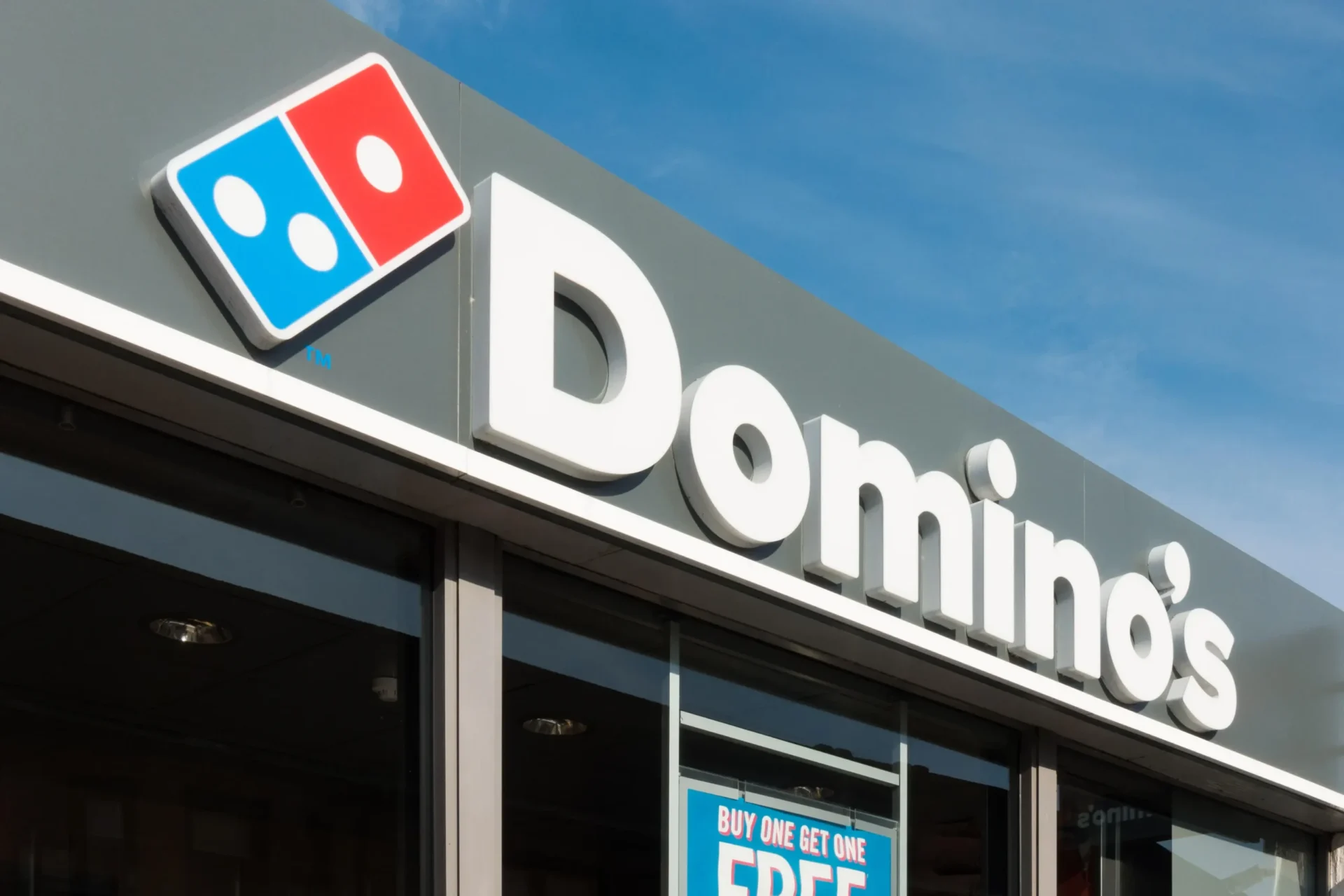
Dominick Devarti opened a singular Michigan pizza restaurant named DomiNick’s, which was then purchased with a $500 down payment in 1960 by Tom Monaghan and his brother James.
With the addition of two new restaurants and opposition from the original founder over his name being used, Domino’s Pizza was born. The plan was to add a dot to the logo for each new restaurant opened, however the tactic was abandoned with the rapid growth of the fast food chain into the 1970’s.
Probably a good choice. As of January 2022, Domino’s Pizza had almost 19,000 locations globally.
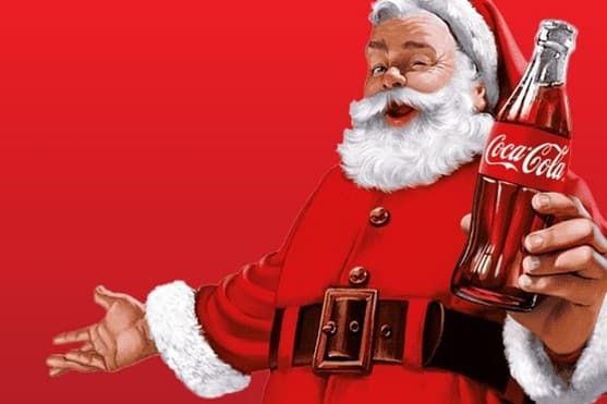
Coca Cola’s distinctive red colour dates back more than 130 years. When first introduced, Coca-Cola was sold in barrels at American drug stores and pharmacies, alongside alcohol. The Coca-Cola Company painted its barrels red to help customs and tax officials distinguish them from the taxed barrels of alcohol.
This distinguishing marker has stuck. And it’s not just cans of Coca-Cola that are instantly recognisable from their red colour now, but another true icon, Santa Claus. Featured in one of the company’s adverts in the 1930’s, wearing his now famous red suit and holding a bottle of Coca-Cola, the Coca-Cola company is credited with shaping the distinctive image of Santa Claus we know and love today.
Sources include:
The Chupa Chups Flower: https://www.logodesignlove.com/chupa-chups-logo
The Angostura Bitters Label: https://www.esquire.com/food-drink/a26029957/what-are-angostura-bitters/, https://vinepair.com/articles/angostura-bitters-oversized-label/
The Guiness Harp: https://www.guinness-storehouse.com/en/discover/story-of-guinness
The Andrex Puppy: https://www.marketingweek.com/andrex-puppy-50-years/ ,
https://www.campaignlive.co.uk/article/campaign-creating-andrex-puppy-1972/1496690
Rolling Stones Hot Lips: https://www.lego.com/en-us/categories/adults-welcome/article/interview-rolling-stones-logo-designer
Tiffany Blue: https://press.tiffany.com/our-story/tiffany-blue/
Nike: https://en.wikipedia.org/wiki/Swoosh , https://www.dividend.com/how-to-invest/7-things-most-investors-dont-know-about-nike-inc-nke/ , https://www.reuters.com/article/factcheck-nike-logo-designer-idUSL1N38L2EB/
The Jolly Green Giant https://erinsweeneydesign.com/marketing/a-history-of-the-most-iconic-brand-mascots-since-1877/, https://en.wikipedia.org/wiki/Green_Giant , https://www.minnpost.com/mnopedia/2013/01/peas-corn-and-beyond-minnesotas-green-giant-company-was-canned-food-pioneer/
Quaker Man: https://erinsweeneydesign.com/marketing/a-history-of-the-most-iconic-brand-mascots-since-1877/ , https://www.businessinsider.com/heres-the-evolution-of-the-quaker-man-2012-2 , https://contact.pepsico.com/quaker/article/who-is-the-man-on-the-quaker-oats-box-is-it-william-penn
Sun Maid Girl: https://www.sunmaid.com/wp-content/uploads/2019/02/US-Edition_Ch3.pdf , https://www.mashed.com/1004034/who-was-the-real-sun-maid-raisins-girl/
Coca-Cola Red: https://en.wikipedia.org/wiki/Coca-Cola, https://www.rd.com/article/coca-cola-logo-red/ , https://www.coca-colacompany.com/about-us/history/haddon-sundblom-and-the-coca-cola-santas