A meta-analysis of 1000 logos in the Distinctive BAT database
When we discuss improving levels of distinctiveness and utilising DBAs, we are generally talking about what happens beyond the logo. In most cases, the logo and a consistent application and elevation should simply be a given. That said, because so much of a brand's identity cascades from that primary mark, it can significantly influence a brand's direction when planning for long-term distinctiveness. The logo debranding trend seen in recent years, which has focused on the paring back of logos, highlights the negative knock-on effects a poorly thought-out design can have on the rest of a brand.
In addition, relying solely on words within a logo to communicate a brand is a misguided perspective. Dual Coding Theory, for example, suggests that the brain processes verbal and visual information through two distinct channels. When a logo utilises both text and a distinctive graphic element, the brain creates two separate "memory traces": one for the word and one for the image.
There is also a wealth of other theories, experiments, and perspectives that reinforce what intuitively makes sense, all supporting the importance of striving for a truly distinctive logo.
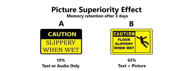
Source: Research stats from John Medina, Brain Rules, 2008. Image from Randy Krum, Cool Infographics

Having tested thousands of assets over the years, we dug into our database to tease apart the specific factors that drive logo distinctiveness. To achieve this, we conducted a meta-analysis of roughly 1,000 logos tested across multiple categories and markets. We reviewed and coded each one based on various elements, such as the use of colour, the presence of specific devices, such as characters or icons, and whether the design was abstract. We then analysed the differences in their BAT scores: our aggregate score of key distinctiveness metrics comprising Asset Recognition plus Brand Attribution, minus Misattribution.
To understand which logo features most influence distinctiveness performance, we also applied a Shapley Value Regression model using the BAT score as the outcome variable. This method determines a variable's true importance by calculating its marginal contribution across every possible combination of variables in the model. It shifts the focus from how "big" a variable's individual impact appears in isolation to how "essential" that variable is to the overall performance.
Our analysis shows two factors neck-and-neck at the top of the rankings, with a "Golden Thread" just slightly ahead as the top ranking factor. In essence, this asks: Does the logo, or part of it, manifest in another lead asset in a meaningful way? A classic example of this is KFC and the consistent use of Colonel Sanders.
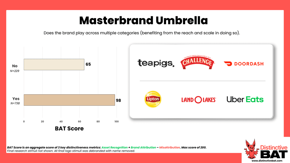
Next in the ranking is "Device Led": whether the logo features a device or other element, such as a lock-up, icon, or character. Third on the list is "Masterbrand Umbrella," which looks at whether the brand plays across multiple categories, benefiting from the reach and scale gained by doing so.
By examining these variables in reverse order, we can clearly see the potential lifts that different features can provide.
First up is the "Literal Brand Name" factor. Logos that are a literal translation of the brand name (think of a green giant for Green Giant, or a shell for Shell) scored significantly higher than those that are not, with a 56-point difference. This is a total distinctiveness hack; if I were creating a brand tomorrow, I’d call it "Pink Elephant" and put a large, distinctive pink elephant front and centre!
Consider how beneficial this has been to a brand like Shell over the years. Their logo sits outside petrol stations globally as billions of people whiz by, taking it in both consciously and subconsciously, while the written name becomes an afterthought. Although this variable showed a massive indexing difference, it sat lower on our final importance list. This is partly due to the low base size of logos that actually utilise this hack, and the fact that other variables, such as characters, often do the heavy lifting in driving that uplift.

Next up is symmetry: is the logo perfectly balanced, or is it off-centre? Interestingly, the vast majority of logos we coded, roughly 92%, were simply run-of-the-mill symmetrical designs. However, those that were slightly off saw an average 18-point uplift. Some of the theories and effects highlighted previously help explain this, such as the slight extra cognitive load required to process the Mountain Dew logo. Hopefully, the designers of this world will find this data point and others useful when convincing a client to be playful and circumvent the norms.
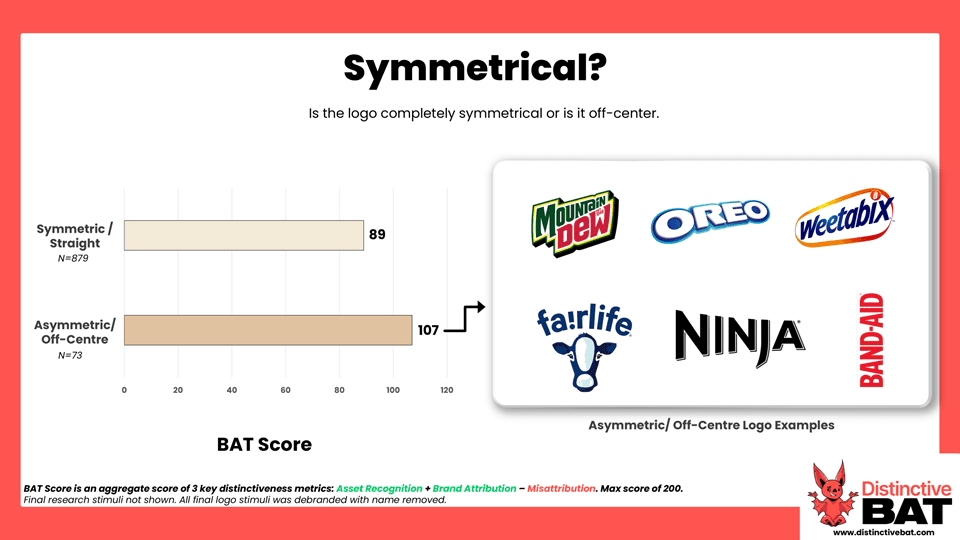
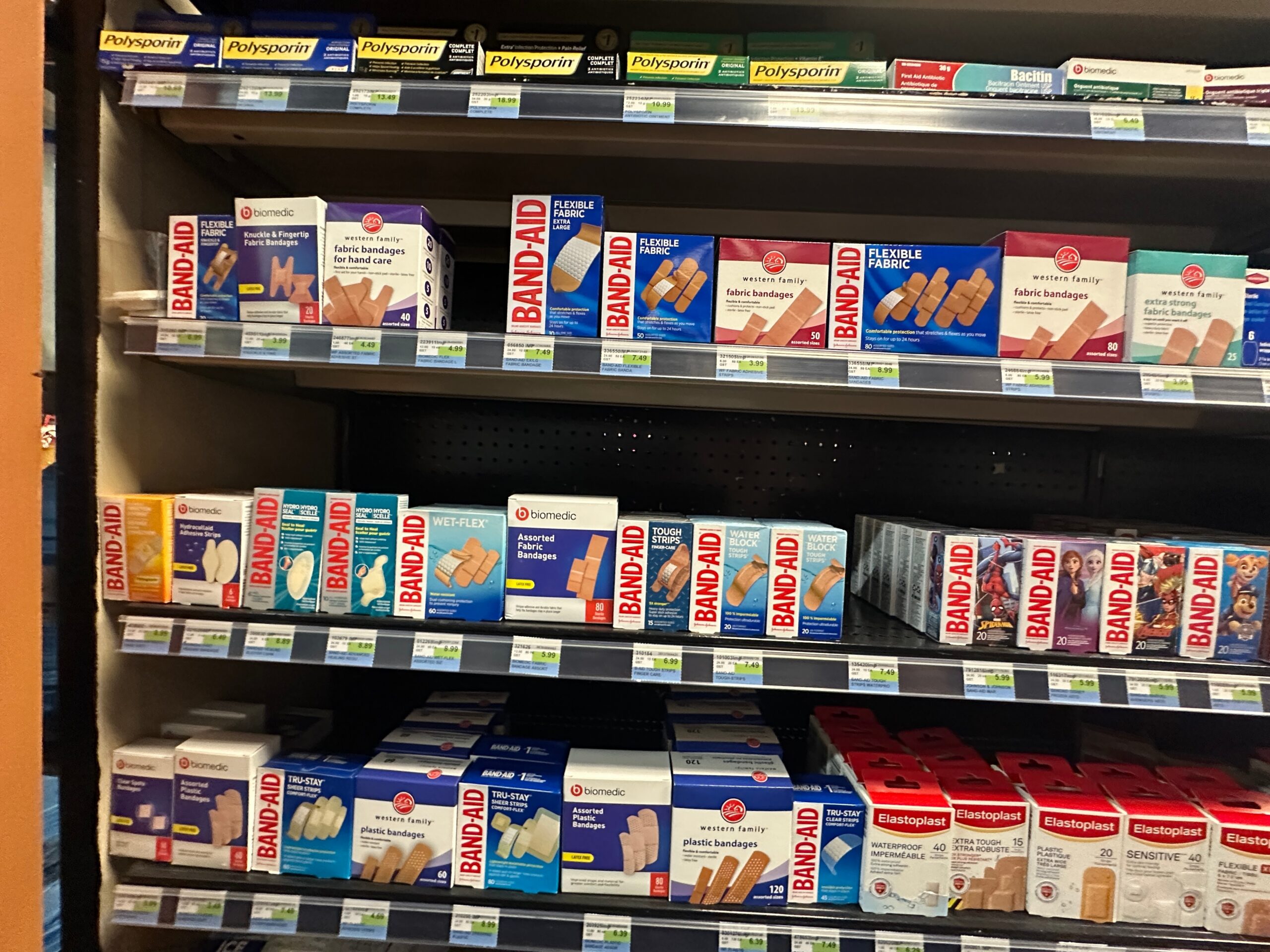
One of our clients, Kenvue, utilises this to great effect with their brand BAND-AID, where a pack featuring the asymmetrical version of the logo stands out clearly on shelf. This practical application reinforces our findings: that moving away from perfectly symmetrical norms can provide a significant boost in recognition and shelf-impact.
The impact of uppercase text versus lowercase text was also tested, with very little lift seen for either. Uppercase logos scored only marginally higher, suggesting that letter case is less of a factor in driving recognition than other more visual elements.

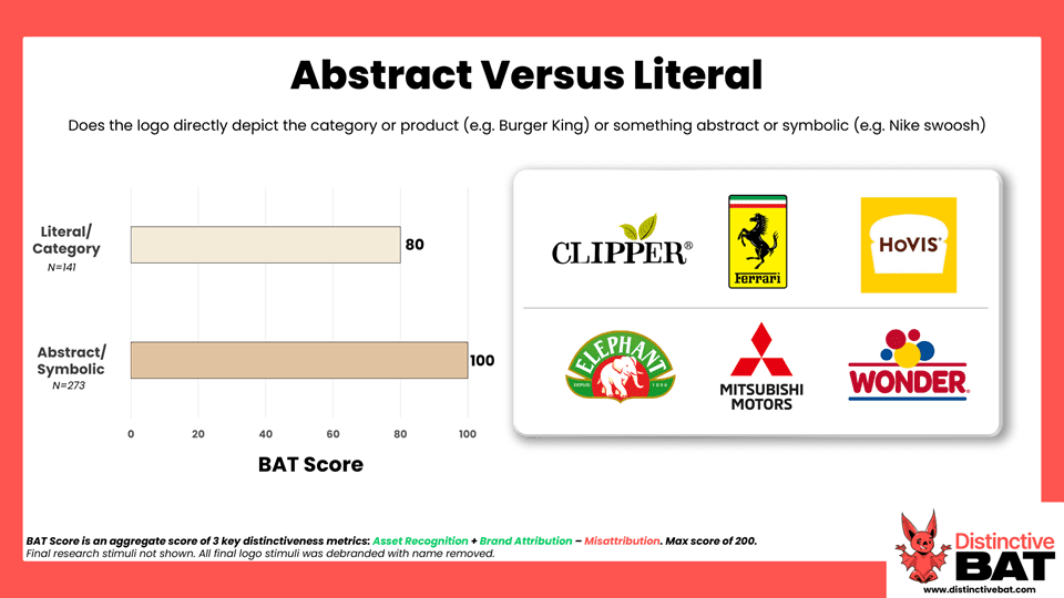
We also looked at the difference between logos that directly depict the category or product, such as Burger King, and those that are abstract or symbolic, such as the Nike swoosh. This is a particularly interesting variable in logo design. There are obvious benefits to communicating the product when starting out, as it provides a shortcut for what you sell; for instance, Chick-fil-A establishes an immediate link to chicken-oriented food through its logo.
However, as a brand grows and scales, the inclusion of something category-generic can be limiting. Take Clipper as an example, which uses tea leaves in its logo. A feature as generic as a tea leaf is incredibly difficult to own because of widespread shared use. By placing it front and centre, a brand may be attempting to embed a device that is unlikely to ever truly become a DBA.
Fonts are among the more subtle distinctive assets, and they typically play a supporting role. It is very rare for a typeface or font to stand out as a primary distinctive asset. This is not to dismiss the contribution a well-crafted font may make to a brand's overall aesthetic; it is just that, in isolation, a font is generally not a distinctive asset. When we look at the impact on logo distinctiveness, we can see some marginal lifts for brands that utilise their logo font elsewhere in a more meaningful and noticeable way, which is to be expected.
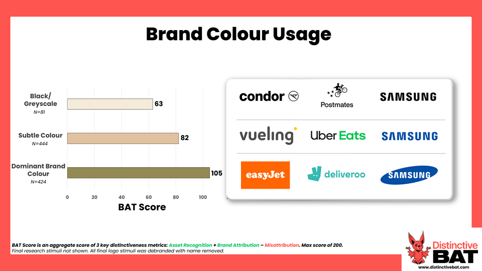
Colour, in isolation, is another asset that rarely ranks among the top-scoring elements. However, its importance as a supporting player is very much highlighted when we look at the spectrum of logos: from those that are colourless (i.e. black), to those with subtle use, and finally to those utilising a dominant brand colour. Like any asset, when a colour is used prominently within the logo, it has a much better chance of being recognised as a standalone asset in its own right later. The logo is an incredibly important device for embedding these secondary assets in the drive for long-term distinctiveness.
Reach and frequency are two key variables contributing to DBA success, and brand size is heavily correlated with both. In most cases, the bigger the brand, the larger the media budget. In addition, the greater the scale of owned touchpoints, driven by physical availability and product in hand, the easier it becomes for a brand to embed distinctive assets. We see this play out clearly in our data, where logos from brands that span multiple categories benefit significantly from the reach and scale gained by doing so.
One of the most important variables in logo distinctiveness is the use of devices within the mark. Script-only logos declined by 46 points in total compared to those that featured some type of device, highlighting how overly simplified logos contribute to a lack of distinctiveness.
We can also dig deeper to identify which device types or features drive the largest average uplifts. In our research, characters consistently come out on top; they are commonly among the highest performing asset types when tested in isolation. The inclusion of a character, or indeed any asset, within a logo functions as a self-reinforcing asset. It immediately enhances the logo's distinctiveness while simultaneously crystallising the character's identity for broader application.
The use of icons or elements can also significantly improve scores, with brands benefiting most when these icons are used consistently elsewhere. Meanwhile, even a lock-up device can move the dial. While simple lockups are common, such as a basic square or circle, other brands have utilised unique shapes that are brilliantly tied back to the brand. Salesforce with the cloud, and Weetabix with the shape of the wheat "biscuit" product, are excellent examples of best practice here.
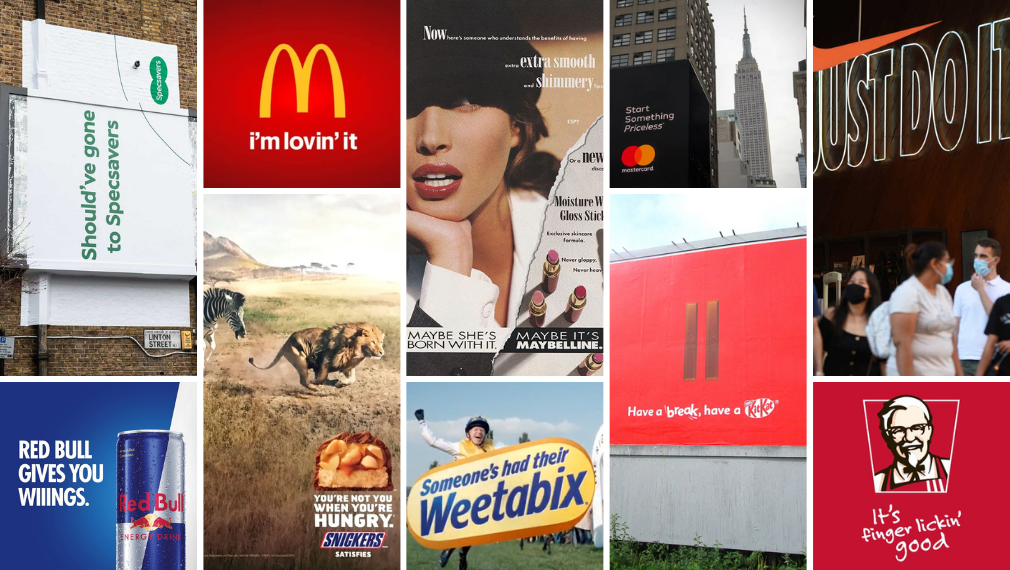
The variable with the biggest impact is the "Golden Thread": the extent to which the logo, or part of it, is reflected or manifests in another lead asset in a meaningful way beyond just colour. This theme is one of our most common recommendations when advising clients on how to dial up their distinctiveness. When distinctive assets share a look and feel, a wonderful synergy is created in which each asset supports the other. When one is used, it naturally increases equity in the other.
This can be activated in various ways, as shown in the examples below. It could be the consistent use of a character across communications, such as the gorilla serving as a lead DBA in advertising while remaining front and centre in the logo for Gorilla Glue. Alternatively, consider Allstate, where the hands icon in the logo is directly linked to their tagline and platform, "You’re in good hands." Another excellent example is AXA, which dials up its red logo icon to create a highly distinctive advertising style.

So, there you have it: the variables that truly impact logo distinctiveness. Whether you are designing a new logo or refreshing an existing one, take these factors into account to set yourself up for success. By doing so, you strengthen not only the logo itself but also the wider suite of distinctive assets that define your brand.
For help understanding the equity in your logo and what makes it distinctive, get in touch for a chat.
Note 1: The final research stimuli are not shown here. All final logo stimuli were debranded with the brand name removed.
Note 2: While most of the logo examples featured above were included in the meta-analysis, a number were not; these were selected specifically for their ability to visually demonstrate the variable in question.