A version of this article first appeared in WARC
With more media channels and touchpoints available where brands show up, thanks in part to the growth of online ecosystems, maintaining consistency is difficult unless it is properly planned.
You have to envy a 1960s marketer. So many brands just had to contend with their brand touchpoint, say packaging, and perhaps a few media channels, where the focus could be given to really nailing a 30-second TVC and perhaps a nice print execution. Modern marketers must contend with tens, if not hundreds, of different touchpoints and platforms where their brand appears. These now span across owned (websites, social accounts, packaging), earned (social media in all its forms), and paid (take your pick from the hundreds of platforms and channels available to a modern media planner).
As Dr. Grace Kite puts it, brands today live in a world that requires “lots of littles.” Creative needs to match the fragmentation of modern media plans, and fragmentation happens within each channel too. The same applies beyond paid media. Brands show up in countless ways: within their own ecosystems, across digital giants that need no introduction, and even on local retailers’ e-commerce platforms.
This is why Distinctive Brand Assets (or DBAs, coined by Byron Sharp and Jenni Romaniuk of the Ehrenberg Bass Institute), are more important than ever—and will only become more so as fragmentation continues (gulp). Distinctive assets help connect disparate marketing activities both consciously and subconsciously. When activated well, they bridge the long and short across all touchpoints at all times. They turn frequency into enhanced repetition, creating a synergistic marketing and communication plan. In many ways, DBAs are what makes an integrated campaign integrated and are the key to making you look like you, wherever you show up.
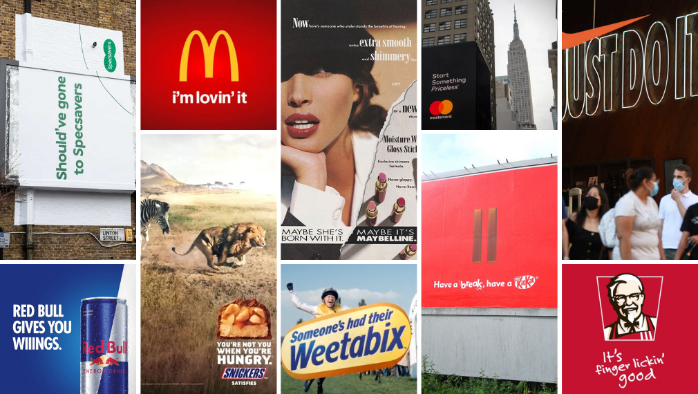
In many ways, creating a distinctive brand is relatively straightforward if you can ensure the mantra of "ruthless consistency” stays with all those driving the strategy and activation. First, identify which assets will take the lead, and then just be ruthlessly consistent with them. While a wide range of assets can be beneficial, it can also lead to a lack of focus and dilution of the use and reach of assets across touchpoints. Balance is key; focus on embedding one or two key assets first and step-load them over time. The number of primary distinctive assets will vary by brand. Some brands, like McDonald's, can afford to have many strong assets, while most others will need to be more focused on identifying a few key assets they can double and triple down on. But even McDonald’s is ruthless.
From our analysis, we can see the biggest drop in distinctiveness scores happen for brands, on average, from their third best-performing asset to their fourth best-performing, and
also from their fourth to fifth highest-scoring asset. This is perhaps obvious enough but it just highlights the point of selecting just one or a few key assets, then prioritising them above all else.
The principles for creating a distinctive brand hold true whether you manage a predominantly “offline” brand, an “online” brand, or anywhere in between. Similar to how the best brands operate in FMCG, a number of master brand assets are required to connect the range, with range unifiers across all SKUs crucial. You can then let other codes help people navigate the category (e.g. flavour via colour).
In the pure digital realm, this can be seen through the likes of Google and their use of colour in “connecting the range” or in their case, their plethora of digital products. Despite having a massive ecosystem themselves, they show up as their best selves consistently. If you are reading this article in Chrome on desktop you might see this in action yourself by glancing to the top of your screen (As I write this piece in Google Docs, with Gmail open in one tab, Google Calendar in another, and a Google Search page in another, 3 out of the 4 tab favicons lean on the four-bar Google colour. Not bad.). This focus ensures any new Google product falls seamlessly into the family, and of course their DBAs are consistently reinforced and played with. And if Google can do this with their many, many products and sub-brands, then smaller brands really don’t have an excuse in being consistent.
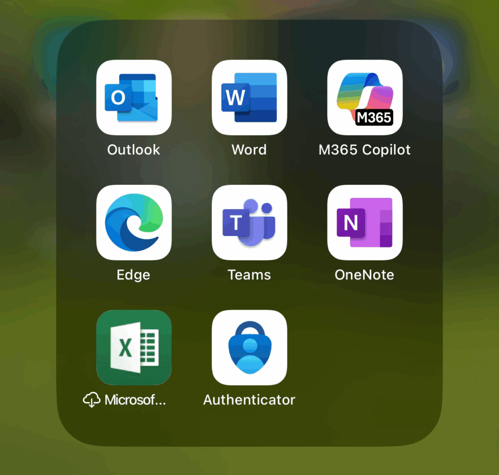
On the other end of the spectrum is Microsoft, which takes a different approach and are much more disparate across their products with little really connecting the range or products, the result is a lack of master brand distinctive assets. They lean more into having individual sub-brands, which in some instances can be more beneficial from a UX perspective.
The food delivery category provides some examples of brands that co-exist between the digital and physical worlds, with a number of brands showing how to maintain consistency between all touchpoints. Both the likes of Deliveroo and foodpanda use their high-reach touchpoints, such as delivery drivers and apps, in embedding their key assets in colour and character-led icons. Foodpanda takes this a step further and leans on their panda character extremely well in advertising and social media. Even these brands, with large reach touchpoints at their disposal, avoid the temptation to dilute their assets by introducing too many new assets or indeed variations which push the boundaries to the point of looking unfamiliar.
The tension point for the more traditionally offline brands, for example consumer food brands, is the need to stand out, whilst being familiar, all within a few pixels. While online grocery shopping is down from the Covid spike, it still represents a decent portion of sales across most markets (e.g. 12% in the U.K.1), and how your logo or packaging shows up within a thumbnail becomes increasingly important. This squeeze in pixels is often given as one of the main drivers behind the debranding trend, and the oversimplification of logos and indeed brands.
Our research on the debranding trend showed that the brands who were the least impacted didn’t oversimplify their logo per se. They highlighted what was memorable about their logo and brand in the first place, whether that be the burger for Burger King or the unique colour and shape of the yellow note for Post-It and elevated this. Know what is distinctive about your logo to ensure you set it free. The same principle applies to packaging, the benefits of a range unifier (likely colour, an icon, or logo structure), ensures you stand out within search results. Whiskas’ recent packaging update was a wonderful example of this in action, doubling down behind colour and the cat silhouette in helping to stand out in store and in the search feed.

Smaller FMCG brands often miss a trick when it comes to range unification. Instead they try to grow through the short-term hit of innovation, pushing out a hodgepodge of SKUs over the years, missing out on the synergistic impact of consistency across touchpoints. Ultimately, brands who lack consistency in any form miss out on the compounding effects that multiple interactions, often just fleeting, consumers have with our brand over time. It is all these familiar interactions in all their forms, that ultimately build a brand.
1 Reuters - Ocado Retail sales rise as sharper prices win customers https://www.reuters.com/business/retail-consumer/ocado-retail-quarterly-sales-up-106-it-wins-more-customers-2024-03-26