While the Carolina Hurricanes might be the reigning Stanley Cup champions, when it comes to distinctiveness, the Detroit Red Wings sit atop the league.
Earlier this year at Distinctive BAT, we surveyed 1,600 U.S. sports fans to identify the most distinctive NFL and NBA franchises. Our latest study puts NHL teams under the same microscope.
The study tested debranded logos and jerseys to see not only which were most recognizable, but also which were most strongly attributed back to the correct franchise. It also accounted for misattribution, where assets were linked to the wrong team. Results were analyzed using the BAT Score, an aggregate measure combining Asset Recognition plus Brand Attribution, minus Misattribution.
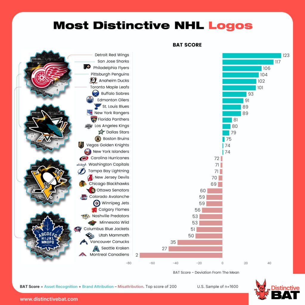
The Detroit Red Wings come out top in both the logo and jersey distinctiveness stakes, while the Anaheim Ducks, Pittsburgh Penguins and Philadelphia Flyers also consistently feature in the top 5. This close relationship is unsurprising given NHL jerseys (uniquely) hero the team logo on the chest.
Across both logos and jerseys, a clear pattern emerges - some NHL brands are almost instantly retrieved in memory; others require greater mental processing before they can be correctly attributed.
Detroit’s iconic red winged-wheel logo is a near-literal visual expression of the team name. The asset and the brand name occupy much the same mental territory; fans don’t need to perform any interpretation to connect one with another. Similarly, the San Jose Sharks, Pittsburgh Penguins and Toronto Maple Leafs all benefit from the synergy between what the team is called and what consumers see.
Taken together, these results point to a broader principle: brands become easier to identify when their visual and verbal assets reinforce the same memory structure, rather than requiring people to create new ones. Distinctive BAT’s recent meta-analysis of more than 1,000 logos discovered that brands often perform disproportionately well when their visual identity directly reinforces their name or core meaning. Think of Apple's apple. Green Giant’s green giant. Target's target. Shell's shell. In each case, the visual asset doesn't just identify the brand, it helps explain it. The most distinctive brands are not just seen more easily - they are understood more easily.
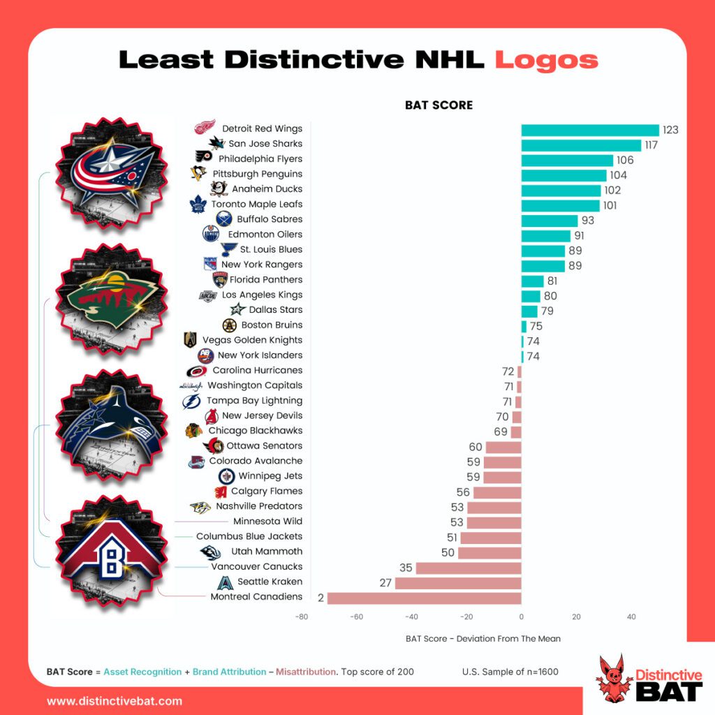
Meanwhile, teams at the lower end of the distinctiveness rankings require an additional mental step between seeing the asset and retrieving the (correct) brand.
The Vancouver Canucks provide perhaps the clearest example. The team name is a cultural reference to Canadians, yet the primary logo centres on an orca (in the shape of a ‘C’). Consumers must first interpret the symbol, connect it to Vancouver, and only then retrieve the franchise. Likewise, the Columbus Blue Jackets name is an ode to Civil War uniforms, while the logo instead draws on Ohio's state flag. Both are meaningful references, but because the logo doesn't depict the blue jacket itself, the connection between what consumers see and what the team is called becomes less immediate.
The Minnesota Wild illustrates a slightly different issue. Unlike ‘Sharks’ or ‘Penguins’, ‘Wild’ is not something that can be easily depicted. The resulting logo therefore relies on a more symbolic construction, embedding nature imagery within a bear’s head. The result is an asset steeped in meaning, but less direct in its connection to the team name. Likewise, the Montreal Canadiens' famous 'CH' monogram carries decades of heritage, but its connection to the team relies heavily on prior knowledge rather than immediate visual understanding.
The same challenge affects many commercial brands. Marketers often gravitate towards metaphorical or symbolic assets because they feel richer, more sophisticated or strategically meaningful. But every layer of interpretation creates another opportunity for confusion.
This is something we have observed repeatedly in Distinctive BAT studies. Assets that require consumers to decode or infer meaning tend to face a tougher path to attribution than those that communicate more directly. Geographic references, historical symbols, abstract monograms and metaphorical icons can all create this challenge. The problem becomes even greater when brands rely on symbols that have multiple potential owners. Stars, crowns, shields, flags and generic geometric shapes may all carry meaning, but they are rarely unique. When consumers encounter them, there are often multiple plausible destinations in memory competing for attention.
NHL distinctiveness data reinforces a lesson that extends far beyond sport. Distinctive brands are built not simply through repeated exposure, but by creating assets that reinforce existing memory structures. Every exposure then strengthens those associations, rather than asking consumers to build new ones. The Detroit Red Wings - and the NHL's other top performers - demonstrate exactly that.